Was ist Trendforschung? von Matthias Horx


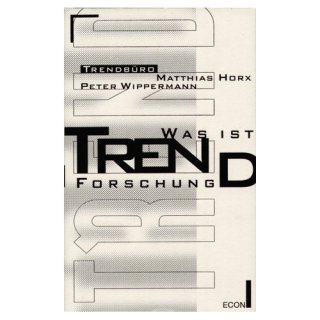
Ein Buch, das sich ausschließlich der Trendforschung widmet. Was ist Trendforschung? Kaum eine Dienstleistung, kaum ein publizistisches Phänomen ist so umstritten und geheimnisumwittert wie die Trendforschung. Während sich Teile der Medien in Ablehnung überschlagen, ist die Dienstleistung für viele Firmen längst zur Selbstverständlichkeit geworden. Prognostische Marktforschung, die Beobachtung “gesellschaftlicher Wandelungsprozesse”, ist im Grunde der Kern jeder unternehmerischen Tätigkeit, und die Dienstleistung “Trendforschung” hat diese Tatsache ins öffentliche Bewußtsein gebracht.

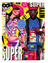
Super Super by Patrick Burgoyne (CR)


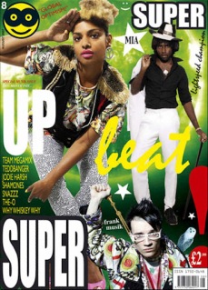
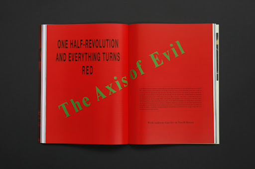
“People said ‘what the fuck is that? It looks like a clown’s been sick’.” Not necessarily the response you might hope for when launching a new style magazine, but it didn’t worry Steve Slocombe. As creative director of the fiercely trendy Super Super, Slocombe is used to being, shall we say, “challenged” about his work…

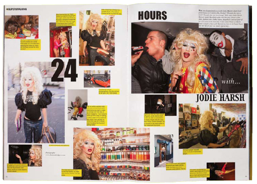
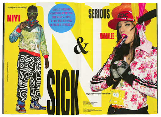
Launched early last year, Super Super’s wilfully distorted typography, day glo colours and total rejection of the holy tenets of magazine design are enough to give more mature art directors a fit of the vapours. It’s MySpace made flesh, with all the clashing cacophony that concept brings to mind.
And yet, according to Slocombe, what underlines it all is “harmony”. “There is nothing in Super Super that is empty or frivolous,” he insists, “everything is there for a reason”.


When it comes to style magazines, Slocombe has form, having previously been editor of Sleazenation. “I took Sleazenation to be one of the top four style magazines, but it was always going to be fourth on that list,” he says, recognising the strength of competitors i-D, Dazed and Confused and, at the time, The Face. “I could see a new generation with a new sensibility coming up so I thought, rather than be fourth, let’s get on this new thing and be first.”
A sign of what was to come came with Slocombe’s last issue at Sleazenation (May 2003). The publishers were away so he took the opportunity to introduce the freeform approach that Super Super has taken to such troubling extremes. He got the sack and went on to open a shop in Brixton with Namalee, former style editor at Sleazenation. The pair launched a magazine, Super Blow, out of which, 18 months ago, came Super Super.

Slocombe cites Scott King, with whom he worked at Sleazenation, as an influence on his design (particularly in “saying what you have to say efficiently”). However, the approach that King took at the magazine was deemed unsuitable for the new title. “At Sleaze, Scott wanted to do it in a book-ish style, but this new generation doesn’t read books so that’s not a relevant reference for them. This is the ADD generation. You have just one chance, one shot. Every time they open the magazine they have to get it.”

It was a period working for photographer Wolfgang Tillmans that most influenced Slocombe’s approach. A Fine Art graduate from St Martins, Slocombe’s role included helping Tillmans install his shows – a process that was, in itself, an artistic exercise. “We’d get a plan of the space and we’d turn up with work in all kinds of different sizes and respond to the space, arranging the work accordingly: it was an organic process about what work would sit best in certain situations,” he explains.

This, then, is the approach that he brings to designing Super Super. There is no predefined grid: Slocombe starts with the images (which may or may not be in focus) and arranges them so as to maximise the space, just as he and Tillmans would on the gallery wall. There are some rules: copy is set in blocks either 90mm or 40mm wide, at 10 point on 12 point leading or eight on 10, using either Helvetica or Times. But word and image rarely line up: “Things feel a lot more human if they are a fraction out,” Slocombe claims, “it’s about a sense of harmony and rhythm”. It’s what sets Super Super apart: “Magazines had become very machine like, very impersonal. Super Super is very human. It speaks to the reader very directly, removes the barriers. The values of the magazine are to be fun, to be positive, to say ‘have a go, you can do this’.”

While other magazines may seek to manipulate pace by contrasting full-bleed images with more detailed spreads, Super Super tries to cram in as much as possible onto every available inch of space. The reason, according to Slocombe, goes back to its readers’ alarmingly short attention spans. Typically aged between 14 and 24, they cannot be guaranteed to look at more than one spread in any particular issue, he claims, so each one has to embody all the values of the magazine. This, he would have us believe, is a generation with a different aesthetic value system. “In the Wallpaper* era, white was seen as expensive, but the young generation now think that if something has lots of colours, it must be more expensive. That,” he says “sums up the shift quite nicely.”

The magazine is not, Slocombe insists, anti-design. “That whole argument that you have to be either a follower of David Carson or of the Swiss School is not the debate we have now – I’ll take the best of both and anything else that’s around. The old way of things was movement followed by anti-movement, now the culture swallows the past and moves on instead of defining itself against what has gone before,” he argues. “I’m not against what has gone before, I just think this is more appropriate for here and now. At the core of the Swiss ideal is efficient communication – well, this is the most appropriate way to communicate to our audience.”

Wouldn’t it be more appropriate to communicate to them online? Or via their omnipresent mobile phones? “We know about print, Slocombe says, “and it’s much easier to make something feel human in print.”

Slocombe seems amused by the extreme reactions his magazine provokes. “I don’t deliberately set out to shock, I want people to say ‘Wow! It’s great’. It’s not meant to be anti-anything. People think it’s thrown together or anti-design, it really isn’t. It could be done entirely in black and white and it would still be recognisable as Super Super.” And what would that be? “Like nothing and everything you have ever seen before.”

Article from Creative Review

The Provocative Mr Meiré by Patrick Burgoyne (CR)


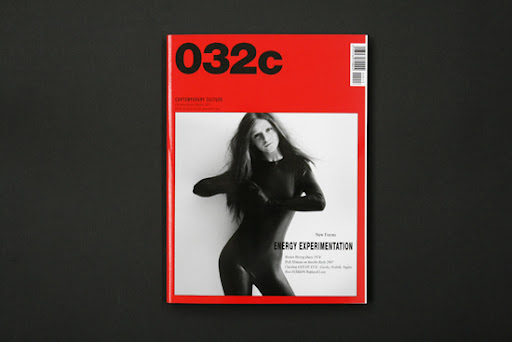
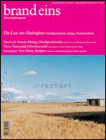
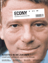
German art director Mike Meiré (above) is renowned in magazine circles for designing two of the most innovative magazines of recent times – brand eins and Econy. Both were celebrated for their clean, cool aesthetic appeal. His latest project, however, deliberately sets out to subvert all the notions of “good” design that his previous work nurtured so carefully. His redesign of cultural magazine 032c was described by Magculture.com as “willfully awkward”. Set against the standards of mainstream graphic design, it is, well, ugly. Here, Meiré explains why…


CR: Did you deliberately set out to break rules with the redesign of 032c? Is it a provocation?
Mike Meiré: Why? Just because it looks different? Or because we stopped following the aesthetical path of the former issues, so people feel disappointed because we haven’t fulfilled their expectations? Making a magazine is about taking a decision, either you do it because you believe in your vision or you follow a market.
032c is a very strong independent magazine with highly sophisticated content, but it became visually predictable. Generally, that’s not a big concern, but for a contemporary culture magazine which appears only two times a year it is.
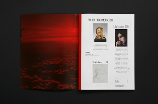
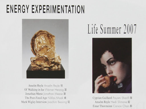
When I met Jörg Koch, the editor-in-chief, it was quite clear from the beginning that he wanted to change the whole thing. He was talking about energy and experimentation, a radical step towards brutality. The meeting took place in my factory in Cologne where I moved my company two years ago – to be independent again, to free myself, to step aside from these everyday commercial expectations. So our profiles were matching immediately!


Meiré previously designed German business titles brand eins and Econy
There are so many magazines out there which pretend to be cool, sophisticated or even culturally relevant. They all look the same, more or less. (…oouh! I know! There are a few good magazines out there! But I am talking about the rest, the 99.9%!) They all play this stylish “classy” Feuilleton-inspired design game. In 1999 I designed the first issue of German economy magazine brand eins (Which is based on the rebirth of beauty. Classic typography combined with white pages and remarkable photography.) which became quietly iconic and got copied a lot. So I know what I am talking about. Since then I am looking for an alternative graphic design wave in Germany … but it hasn’t happened so far. So I used my chance with 032c to come up with something different. But this was only possible because of the incredible quality 032c stands for.

In fact the new issue is exactly worked around the essence of 032c. Remember their first issue; bold, rough, intellectual, black and white, on the cover a huge square in pantone 032c? For the redesign I just went back to their roots, put the square back on the cover with Cecilia (the curvy girl in a black rubber cat suit) inside and the PANTONE 032c Red around it. Very simple, very strong. Feels like a subversive version of Germany’s number one politics magazine Der Spiegel.
Of course the stretched typography makes you look twice. Like an accident in our eye candy lifestyle magazine world. ERROR. I am always interested in the concept of evolution = harmony/break/harmony …
Making a magazine is finding out the right look for its content, its attitude. And 032c has its own ways to combine different stories ranges from war-photography, fashion, art, architecture, politics, etc. To me it’s the only way to create a unique identity, if you don’t want to be “me too”. Maybe you don’t please the common sense anymore – but you become who you are, authentic in your own way.
So coming back to your question. YES, I did deliberately set out to break rules with this and YES, it is a provocation – but in the first place to myself! I remember a quote from the German artist Martin Kippenberger I have published in my own magazine AD2G 1990 “Es gibt nur den Dreck und die Schönheit im Dreck” (There is only dirt and the beauty within) … if every magazine or every building or every brand or everybody tries to look appealing somehow in the same idea of being modern, it becomes interesting to go the opposite. Because life has different kinds of beauty to present.
CR: Were you influenced by anything specific?

MM: I remembered a few things I made before the “APPLE Age”. All done with the great help of a copy machine. Some early artist catalogues and a small art newspaper. But for the 032c everything really started with a very small stretched copy next to a picture. It was somehow strangely beautiful. A bit dark but very refreshing. It needed to be balanced because I didn’t want to go retro.
CR: Is the headline type stretched or did you have a special typeface drawn like that?

MM: This was actually the hardest job to get right. Most of the time my assistant Tim Giesen was stretching types like hell. The idea was getting us into a kind of “darker”. We combined the stretched ones with types from the Helvetica and Futura family and the Times New Roman Condensed. We had to recondition our minds aesthetically wise while we were working on 032c. After some days everything commercial looked so boring… unbelievable! It was a bit like a trip.
I wanted to reveal a darker beauty which embraces mature elegance and coolness. When the layouts were done we sent them to Jörg, based in Berlin, he replied with his one-word-code: “KILLER!”
CR: Is it anti-design?

MM: It is what it is. Isn’t it? If you call it anti-design, that’s fine with me. I think being anti is important these days. Sometimes there is a real need to say NO. There is so much stuff around us …
As I already said I became a bit tired of all these look-a-like magazines. They’re all made very professional – but I was looking for something more charismatic. I wanted to search for an interesting look beyond the mainstream. Maybe something more “brutal” as Jörg used to say. We wanted a truthful intelligent independent magazine with a touch of underground.
I think we did it. And people may feel this and that’s why they are a bit confused because we all are used to this kind of efficient-streamlined-whatever-correctness…
Article from Creative Review


The New Ugly by Patrick Burgoyne (CR)


Following all the debate generated by our interviews with Super Super’s Steve Slocombe and 032c art director Mike Meiré, here is the piece from the current issue of Creative Review which draws on those sources to set the work into a wider context.


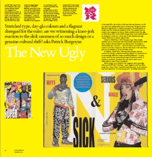
Stretched type, day-glo colours and a flagrant disregard for the rules: are we witnessing a knee-jerk reaction to the slick sameness of so much design or a genuine cultural shift?
In the early 90s, the mother of all rows blew up between, on the one hand, the traditionalist school of American designers led by Massimo Vignelli and, in defiant opposition, the avant garde of Emigre and the Cranbrook Academy of Art. The catalyst was an essay in Eye magazine by Steven Heller entitled Cult of the Ugly, in which the world’s most prolific design writer took Cranbrook and its students to task over, as he saw it, their gratuitously ugly output. Well now, it seems, ugly is back.


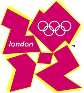
Exhibit A: Wolff Olins’ 2012 Olympics logo. When finally wheeled out to confront an ever-more-hostile national press, Wolff Olins creative director Patrick Cox claimed that “Its design is intentionally raw, it doesn’t… ask to be liked very much. It was meant to provoke a response, like the little thorn in the chair that gets you to breathe in, sit up and take notice.”
In addition, Wolff Olins’ chairman Brian Boylan claimed success for having “created something original in a world where it is increasingly difficult to make something different”. In other words, when we are surrounded by logos created to a slick, if mediocre, aesthetic standard, the only way to stand out is deliberately to reject those standards.


Which brings us to Exhibit B: the magazine that seemingly influenced Wolff Olins’ thinking – style magazine and New Rave progenitor, Super Super. Launched early last year, its art direction has been likened to “a clown being sick”. Its wilfully distorted typography, day glo colours and total rejection of the holy tenets of magazine design are enough to give more mature art directors a fit of the vapours. It’s MySpace made flesh, with all the clashing cacophony that concept brings to mind.
And yet, according to its creative director, Steve Slocombe, what underlines the magazine is “harmony”. “There is nothing in Super Super that is empty or frivolous,” he insists, “everything is there for a reason.”
When it comes to style magazines, Slocombe has form, having previously been editor of Sleazenation.. His last issue there (May 2003 which, incidentally, got him the sack) introduced the freeform approach that Super Super has taken to such troubling extremes. But, he says, it was a period working for photographer Wolfgang Tillmans that most influenced his approach. A fine art graduate from St Martins, Slocombe’s role included helping Tillmans install his shows – a process that was, in itself, an artistic exercise. “We’d get a plan of the space and we’d turn up with work in all kinds of different sizes and respond to the space, arranging the work accordingly: it was an organic process aboutwhat work would sit best in certain situations,” he explains.


This, then, is the approach that he brings to designing Super Super. There is no predefined grid: Slocombe starts with the images (which may or may not be in focus) and arranges them so as to maximise the space, just as he and Tillmans would on the gallery wall. There are some rules: copy is set in blocks either 90mm or 40mm wide, at 10 point on 12 point leading or eight on 10, using either Helvetica or Times. But word and image rarely line up: “Things feel a lot more human if they are a fraction out,” Slocombe claims, “it’s about a sense of harmony and rhythm.” It’s what sets Super Super apart: “Magazines had become very machine-like, very impersonal. Super Super is very human. It speaks to the reader very directly, removes the barriers. The values of the magazine are to be fun, to be positive, to say ‘have a go, you can do this’.”

While other magazines may seek to manipulate pace by contrasting full-bleed images with more detailed spreads, Super Super tries to cram in as much as possible onto every available inch of space. The reason, according to Slocombe, is that its readers (typically aged between 14 and 24) are part of the “ADD Generation”. Their alarmingly short attention spans mean that they cannot be guaranteed to look at more than one spread in any particular issue, he claims, so each one has to embody all the values of the magazine. And, he says, they have a completely different idea about colour. If you are 30-plus, white may embody sophistication and expense, but to the Super Super “reader” it is colour that does this – bright colours and lots of them.


The magazine is not, Slocombe insists, anti-design. “That whole argument that you have to be either a follower of David Carson or of the Swiss School is not the debate we have now – I’ll take the best of both and anything else that’s around. The old way of things was movement followed by anti-movement, now the culture swallows the past and moves on instead of defining itself against what has gone before,” he argues. “I’m not against what may have gone before, I just think this is more appropriate for here and now. At the core of the Swiss ideal is efficient communication – well, this is the most appropriate way to communicate to our audience.”

The charitable view would be that Slocombe’s lack of formal design training has left him unencumbered by the profession’s history and therefore more able to seek out new forms of expression: the uncharitable view would be that Super Super is simply a mess, created for young kids who will move on to more sophisticated tastes as they mature. And yet the magazine’s core concerns – of seeking to inject some quirky humanity into a slickly homogenised magazine market, of being true to a vision deemed appropriate to the readership – are shared by a designer with a far more “establishment” pedigree. Which brings us to Exhibit C: Mike Meiré’s recent redesign of German cultural magazine 032c.


Meiré is renowned in magazine circles for his art direction of Brand Eins, a German business magazine that mixed beautiful photography with classic typography and lots of white space. That was in 1999: since then, Meiré says he’s been waiting for an alternative approach to emerge, but to no avail. “There are so many magazines out there which pretend to be cool, sophisticated or even culturally relevant. They all look the same,” he says. “I became a bit tired of all these look-a-like magazines,” which, through Brand Eins, he helped create. “They’re all made very professionally but I was looking for something more charismatic. I wanted to search for an interesting look that was beyond the mainstream.”


The result is a magazine that, wrote designer Jeremy Leslie on his blog MagCulture, “uses typography and layouts that are hard to describe as anything but ugly. The pages feel thrown together. When I expressed my confusion about the redesign to the magazine’s founder/editor Joerg Koch,” continued Leslie, “I received a surprising reply. ‘Thanks for your message which made me incredibly happy! This is exactly what we wanted to achieve, this sort of engagement with a magazine where you question yourself if it makes sense, if it is really brilliant or simply daft.’”
Meiré readily admits that “Yes, I did deliberately set out to break rules with this and yes, it is a provocation – but in the first place to myself! If every magazine or every building or every brand or everybody tries to look appealing by using the same idea of being modern, it becomes interesting to go in the opposite direction, because life has different kinds of beauty to present. If people feel confused by it, it is because we are all so used to this kind of efficient, streamlined, correctness.”


In his original essay, Heller slammed those using ugliness as a knee-jerk reaction to the status quo. “Ugliness as its own virtue diminishes all design,” he said. All three projects cited here could be accused of such a crime. However, Heller also argued that ugliness “is not a problem when it is a result of form following function”. Though none of Wolff Olins, Slocombe or Meiré may feel comfortable with describing their work as ugly, they all lay claim to their pursuit of the latter.
“Making a magazine is about finding the right look for its content, its attitude,” Meiré argues. “To me it’s the only way to create a unique identity. [In doing so] maybe you don’t please the [mainstream] anymore – but you become who you are, authentic in your own way.”
This, it would seem, is the crux of the matter. If all three of these projects, and other contemporary works in the same vein, are merely an attempt to zig while the world zags, to be different for difference’s sake, then they need not detain us for long. If, however, they are the honest result of form following function and thereby represent the visual expression of a genuine cultural shift, then that becomes something altogether more interesting.
Take colour, for instance. Both the Olympics logo and Super Super propose a new relationship between colour and quality. That bright no longer necessarily equals trashy. That a younger generation is inverting the chromatic scale as it relates to notions of quality and class. Super Super claims to address the impact of changing patterns of media consumption on design. This, it says, is what happens when your “readers” are not readers at all but mere “scanners” of content who are as likely to start at page 46 as page one. And all three claim to be fired by a desire to involve their audiences rather than simply presenting themselves to them. Inevitably this would seem to require a move away from the slick and the forbidding, toward, as Slocombe describes it, something more “human”.
There is more than empty styling at work here. Something like Super Super can easily be dimissed as just a few kids messing about, but, as a recent piece on New Rave in The Sunday Times Style magazine noted, that’s pretty much how all trends start. All three projects are well-intentioned attempts to respond to and engage with a shifting cultural landscape. If this is the future, it may not be a pretty sight.

Interview with TwoPointsNet


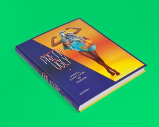
In the new Gestalten publication ‘Pretty Ugly’, the two editors, Lupi Asensio og Martin Lorenz have been on a comprehensive journey through masses of design portfolios on the lookout for anything with a rebellious urge to be ugly.

Better known as graphic designers, educators, brilliant researchers and owners of TwoPoints.net, the two inquisitive minds have created a publication that catches and reflects upon an important tendency in contemporary design. Martin has, before he opened TwoPoints.net together with Lupi, been working for Berlin-based Hort, who are known for their experimenting approach to graphic design as well as spotting fresh tendencies.
Both Lupi and Martin believe, as designers, that it is more important to be a producer of content rather than just to be a communicater of others ideas. For us, this attitude makes them the perfect couple for the Pretty Ugly project, and out of curiosity we sent them some questions about this wierd, new and refreshing way of thinking design. Below you can read more about the process behind the book, their greatest discoveries and how they see themself as part of the new uglyness wave.

Can you tell us a little about the process, how has it been working as the editor on this book?
“Pretty Ugly” is our 13th book as editors. Each book is very different and a great opportunity to learn more about a specific theme. “Pretty Ugly” was an interesting experience because we started with one idea about the movement and ended up with another. The toughest part about doing that book was acctually that there is so much material out there. The first layout, with all the material we received, resulted in over 900 pages and during the selection phase we even encountered more material. It took us weeks to boil down the book to 224 pages.

Would you say that this kind of ‘uglyness’ is a common tendency in contemporary graphic design?
When we were putting the book together, we were aware of the reflections on the movement by Steven Heller, Michael Bierut (Design Observer) and Patrick Burgoyne (Creative Review). The last two articles cited Mike Meiré’s redesign of 032c (2007), a cultural, german magazine, in which he used stretched Helvetica (now it would probably be Arial) in the headlines, something that was done a lot in the 80s, but forgotten since. This simple gesture shocked designers who thought they’d seen everything. Meiré seemed to have found the last sacrilege in graphic design. Over the years the movement evolved into what we call “Pretty Ugly”.

What are the greatest discoveries you have done through your research?
That the movement isn’t just about aesthetics. Of course, there are obvious aesthetic qualities: intentionally ‘bad’ typography; using system typefaces like Arial, Helvetica or Times; stretching them; having too much or too little letter or line spacing; deforming type on a scanner or a copier, etc. but behind the aesthetics there is more than just visual rebellion. We see a shift in the role the designer plays in the communication process. Design has been seen as the vehicle between sender and receiver. An invisible servant of information. Today, the designer has a voice which has become an important part of the communication process. Often we even see attempts to visualize the design process itself in the work.

As a design studio, do you use these kinds of aesthetics yourselves, and why/how?
You tell us. We might have some works that are pretty ugly. 😉 …, but to be honest we never really try to do anything trendy. In contrary, if something has become a trend we have lost the interest in it. With each project we try to develop an unique visual language based in the character of the product/firma/institution.

What do you think is interesting about working with uglyness?
Working with uglyness isn’t that interesting, in fact, after doing that book, it is very hard for us to consider something ugly. What is really interesting though is the perception of ugly. In cases of Pretty Ugly it mostly means that something has been created, that society isn’t used to, that it doesn’t understand yet. Something that still has to be “learned”.

Do you have any favorite projects/studios from the book, that you would like to highlight?
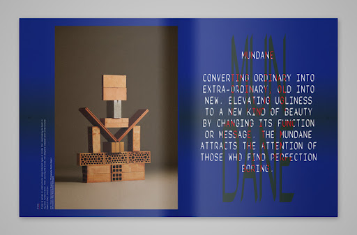
As we said earlier, there is too much good material out there. In graphic design you have studios like Superscript2 using amateur photography (p.2) or diagramms that seems to have been taken from PowerPoint (p.29). In photography you have Nacho AlegreAna Domínguez and Omar Sosa doing installations with bricks (p.46) or bread (p.56 & p.57), but as well Inês Nepomuceno photographing a still life of an aftermeal situation, making them look like paintings (p.54 & p.55) or Brea Souders intentional “mistakes” in “Seine With Fingers” or “Under My Thumb (Heat)” (p.76). In product design you have Maarten Baas’ “Plastic Chair in Wood” (p.61) and Jerszy Seymour’s “New Order” (p.67) chair, based upon the same cheap plastic chair.

Anything else you would like to add?
The aesthetics will change, but we hope that some of the attitude will survive. We need more brave designers who are able to think out of the box. Mainly for three reasons: First, responsibility. A designer that sees him or herself as a co-author of the message begins to feel responsible for that message. It was easier to hide yourself behind the client’s messages when the designer was invisible. Second, initiative. Becoming a co-author instills entrepreneurship. Instead of waiting for commissioned work, designers nowadays are taking more initiative and inventing their own products or projects. Lastly, flexibility. A movement that understands design as a process is more flexible. It can more easily adapt, adjust and improve.

Interview from I do Art

Trend Forecaster’s Handbook by Martin Raymond


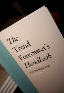
The Trend Forecaster’s Handbook is a sharp, in-depth and highly visual textbook and teaching aid forstudents and academics keen to know more about the world of trends, trend forecasting, and consumer-insight techniques.

This “how to” book provides design students with skills to understand and track trends and use them to inform their research, design, and product development. With quotes, interviews, and case studies of key players
.

Cult of the Ugly by Steven Heller

In the early 1990s Steven Heller takes on the word ugly as he sees it applied to graphic design and design education. En route, his views of art history, pop culture and recent design trends are considered in his essay about style and meaning in design.
‘Ask a toad what is beauty… He will answer that it is a female with two great round eyes coming out of her little head, a large flat mouth, a yellow belly and a brown back.’ (Voltaire, Philosophical Dictionary, 1794). Ask Paul Rand what is beauty and he will answer that ‘the separation of form and function, of concept and execution, is not likely to produce objects of aesthetic value.’ (Paul Rand, A Designer’s Art, 1985). Then ask the same question to the Cranbrook Academy of Art students who created the ad hoc desktop publication Output (1992), and judge by the evidence they might answer that beauty is chaos born of found letters layered on top of random patterns and shapes. Those who value functional simplicity would argue that the Cranbrook student’s publication, like a toad’s warts, is ugly. The difference is that unlike the toad, the Cranbrook students have deliberately given themselves the warts.
Output is eight unbound pages of blips, type fragments, random words, and other graphic minutiae purposefully given the serendipitous look of a printer’s make-ready. The lack of any explanatory précis (and only this end note: ‘Upcoming Issues From: School of the Art Institute of Chicago [and] University of Texas,’) leaves the reader confused as to its purpose or meaning, though its form leads one to presume that it is intended as a design manifesto, another “experiment” in the current plethora of aesthetically questionable graphic output. Given the increase in graduate school programs which provide both a laboratory setting and freedom from professional responsibility, the word experiment has to justify a multitude of sins.
The value of design experiments should not of course be measured only by what succeeds, since failures are often steps towards new discoveries. Experimentation is the engine of progress, its fuel a mixture of instinct, intelligence or discipline is in the mix. This is the case with certain of the graphic design experiments that have emanated from graduate schools in the U. S. and Europe in recent years work driven by instincts and obscured by theory, with ugliness its foremost by-product.
How is ugly to be defined in the current Post-modern climate where existing systems are up for re-evaluation, order is under attack and the forced collision of disparate forms is the rule? For the moment, let us say that ugly design, as opposed to classical design (where adherence to the golden mean and a preference for balance and harmony serve as the foundation for even the most unconventional compositions) is the layering of inharmonious graphic forms in a way that results in confusing messages. By this definition, Output could be considered a prime example of ugliness in the service of fashionable experimentation. Though not intended to function in the commercial world, it was distributed to thousands of practising designers on the American Institute of Graphic Arts and American Center for Design mailing lists, so rather than remain cloistered and protected from criticism as on-campus “research”, it is a fair subject for scrutiny. It can legitimately be described as representing the current cult of ugliness.
The layered images, vernacular hybrids, low-resolution reproductions and cacophonous blends of different types and letters at once challenge prevailing aesthetic beliefs and propose alternative paradigms. Like the output of communications rebels of the past (whether 1920s Futurists or 1960s psychedelic artists), this work demands that the viewer or reader accept non-traditional formats which at best guide the eye for a specific purpose through a range of non-linear “pathways”, and at worst result in confusion.
But the reasons behind this wave are dubious. Does the current social and cultural condition involve the kind of upheaval to which critical ugliness is a time-honoured companion? Or in the wake of earlier, more serious experimentation, has ugliness simply been assimilated into popular culture and become a stylish conceit?
The current wave began in the mid-1970s with the English punk scene, a raw expression of youth frustration manifested through shocking dress, music and art. Punk’s naive graphic language – an aggressive rejection of rational typography that echoes Dada and Futurist work – influenced designers during the late 1970s who seriously tested the limits imposed by Modernist formalism. Punk’s violent demeanour surfaced in Swiss, American, Dutch and French design and spread to the mainstream in the form of a “new wave”, or what American punk artist Gary Panter has called “sanitised punk”. A key anti-canonical approach later called Swiss Punk – which in comparison with the gridlocked Swiss International Style was menacingly chaotic, though rooted in its own logic – was born in the mecca of rationalism, Basel, during the late 1970s. For the elders who were threatened (and offended) by the onslaught to criticise Swiss Punk was attacked not so much because of its appearance as because it symbolised the demise of Modernist hegemony.
Ugly design can be a conscious attempt to create and define alternative standards. Like war-paint, the dissonant styles which many contemporary designers have applied to their visual communications are meant to shock an enemy – complacency – as well as to encourage new reading and viewing patterns. The work of American designer Art Chantry combines the shock-and-educate approach with a concern for appropriateness. For over a decade Chantry has been creating eye-catching, low-budget graphics for the Seattle punk scene by using found commercial artefacts from industrial merchandise catalogues as key elements in his posters and flyers. While these ‘unsophisticated’ graphics may be horrifying to designers who prefer Shaker functionalism to punk vernacular, Chantry’s design is decidedly functional within its context. Chantry’s clever manipulations of found ‘art’ into accessible, though unconventional, compositions prove that using ostensibly ugly forms can result in good design.
Post-modernism inspired a debate in graphic design in the mid-1970s by revealing that many perceptions of art and culture were one-dimensional. Post-modernism urgently questioned certainties laid down by Modernism and rebelled against grand Eurocentric narratives in favour of multiplicity. The result in graphic design was to strip Modernist formality of both its infrastructure and outer covering. The grid was demolished, while neo-classical and contemporary ornament, such as dots, blips and arrows, replaced the tidiness of the canonical approach. As in most artistic revolutions, the previous generation was attacked, while the generations before were curiously rehabilitated. The visual hallmarks of this rebellion, however, were inevitably reduced to stylistic mannerisms which forced even more radical experimentation. Extremism gave rise to fashionable ugliness as a form of nihilistic expression.
In “Ode on a Grecian Urn” (1819), the Romantic poet John Keats wrote the famous lines: ‘Beauty is truth, truth beauty, – that is all/Ye know on earth, and all ye need to know.’ Yet in today’s environment, one standard of beauty is no more the truth than is one standard of ugliness. It is possible that the most conventional-busting graphic design by students and alumni of Cranbrook, CalArts and Rhode Island School of Design, among other hothouses where theoretical constructs are used to justify what the untutored eye might deem ugly, could become the foundation for new standards based on contemporary sensibilities. Certainly, these approaches have attracted many followers throughout the deign world.
‘Where does beauty begin and where does it end?’ wrote John Cage in Silence(1961). ‘Where it ends is where the artist begins.’ So in order to stretch the perimeters of art and design to any serious extent it becomes necessary to suspend popular notions of beauty so that alternative aesthetic standards can be explored. This concept is essential to an analysis of a recent work by the Chicago company Segura, who designed the programme/announcement for the 1993 How magazine “Creative Vision” conference and whose work represents the professional wing of the hothouse sensibility. Compared to the artless Output, Segura’s seemingly anarchic booklet is an artfully engineered attempt to direct the reader through a maze of mundane information. Yet while the work might purport to confront complacency, it often merely obstructs comprehension.
A compilation of variegated visuals, the How piece is a veritable primer of cultish extremes at once compelling for its ingenuity yet undermined by its superficiality. Like a glutton, Segura has stuffed itself with all the latest conceits (including some of its own concoction) and has regurgitated them on to the pages. At first the juxtapositions of discordant visual material appear organic, but in fact little is left to chance. The result is a catalogue of disharmony in the service of contemporaneity, an artefact that is already ossifying into a 1990s design style. It is a style that presumes that more is hipper than less, confusion is better than simplicity, fragmentation is smarter then continuity, and that ugliness is its own reward.
But is it possible that the surface might blind one to the inner beauty (i.e. intelligence) of this work? Ralph Waldo Emerson in The Conduct of Life (1860) wrote: ‘The secret of ugliness consists not in irregularity, but in being uninteresting.’ Given Emerson’s measure, it could be argued that design is only ugly when devoid of aesthetic or conceptual forethought – for example, generic restaurant menus, store signs and packages. Perhaps, then, the How booklet, which is drowning in forethought, should be “read” on a variety of levels wherein beauty and ugliness are mitigated by context and purpose. Perhaps – but given the excesses in this work, the result can only be described as a catalogue of pretence.
During the late 1940s and 1950s the Modernist mission was to develop design systems that would protect the global (not just corporate) visual environment from blight. Yet while Modernism smoothed out the rough edges of communications by prescribing a limited number of options, it also created a recipe for mediocrity. If a Modernist design system is followed by rote, the result can be as uninteresting and therefore as ugly – according to Emerson’s standard – as any non-designed newsletter or advertisement. So design that aggressively challenge the senses and intellect rather than following the pack should in theory be tolerated, if not encouraged.
For a new generation’s ideas of good design – and beauty – to be challenged by its forerunners is, of course, a familiar pattern. Paul Rand, when criticised as one of those “Bauhaus boys” by American type master W. A. Dwiggins in the late 1930s, told an interviewer that he had always respected Dwiggins’ work, ‘so why couldn’t he see the value of what we were doing?’ Rudy VanderLans, whose clarion call of the “new typography” Emigre has been vituperatively criticised by Massimo Vignelli, has not returned the fire, but rather countered that he admires Vignelli’s work despite his own interest in exploring alternatives made possible by new technologies. It could be argued that the language invented by Rand’s “Bauhaus boys” challenged contemporary aesthetics in much the same way as VanderLans is doing in Emigre today. Indeed VanderLans, and those designers whom Emigrecelebrates for their inventions – including Cranbrook alumni Edward Fella, Jeffery Keedy and Allen Hori – are promoting new ways of making and seeing typography. The difference is that Rand’s method was based strictly on ideas of balance and harmony which hold up under close scrutiny even today. The new young turks, by contrast, reject such verities in favour of imposed discordance and disharmony, which might be rationalised as personal expression, but not as viable visual communication, and so in the end will be a blip (or tangent) in the continuum of graphic design history.
Edward Fella’s work is a good example. Fella began his career as a commercial artist, became a guest critic at Cranbrook and later enrolled as a graduate student, imbuing in other students an appreciation for the naïf (or folk) traditions of commercial culture. He ‘convincingly deployed highly personal art-based imagery and typography in his design for the public,’ explains Lorraine Wild in her essay “Transgression and Delight: Graphic Design at Cranbrook” (Cranbrook Design: the New Discourse, 1990). He also introduced what Wild describes as “the vernacular, the impure, the incorrect, and all the other forbidden excesses” to his graduate studies. These excesses, such as nineteenth-century fat faces, comical stock printers’ cuts, ornamental dingbats, hand scrawls and out-of-focus photographs, were anathema to the early Modernists, who had battled to expunge such eyesores from public view.
Similar forms had been used prior to the 1980s in a more sanitised way by American designers such as Phil Gips in Monocle magazine, Otto Storch inMcCalls magazines, and Bea Feitler in Ms. magazine. For these designers, novelty job printers’ typefaces and rules were not just crass curios employed as affectations, but appropriate components of stylish layouts. While they provided an alternative to the cold, systematic typefaces favoured by the International Style, they appeared in compositions that were nonetheless clean and accessible. These were not experiments, but “solutions” to design problems.
Two decades later, Fella too re-employed many of the typically ugly novelty typefaces as well as otherwise neutral canonical letterforms, which he stretched and distorted to achieve purposefully artless effects for use on gallery and exhibition announcements. Unlike Gips’ and Feitler’s work, these were aggressively unconventional. In Cranbrook Design: the New Discourse, Fella’s challenges to “normal” expectations of typography are described as ranging from “low parody to high seriousness”. But the line that separates parody and seriousness is thin, and the result is ugliness. As a critique of the slick design practised throughout corporate culture, Fella’s work is not without a certain acerbity. As personal research, indeed as personal art, it can be justified, but as a model for commercial practice, this kind of ugliness is a dead end.
‘Just maybe, a small independent graduate program is precisely where such daunting research and invention in graphic design should occur,’ argues Wild. And one would have to agree that given the strictures of the marketplace, it is hard to break meaningful ground while serving a clients needs and wants. Nevertheless, the marketplace can provide important safeguards – Rand, for example, never had the opportunity to experiment outside the business arena and since he was ostensibly self-taught, virtually everything he invented was “on the job”. Jeffery Keedy and Allen Hori, both of whom had a modicum of design experience before attending Cranbrook, availed themselves of the luxury of experimenting free of marketplace demands. For them, graduate school was a place to test out ideas that “transgressed” as far as possible from accepted standards. So Wild is correct in her assertion that it is better to do research and development in a dedicated and sympathetic atmosphere. But such an atmosphere can also be polluted by its own freedoms.
The ugly excesses – or Frankenstein’s little monsters like Output – are often exhibited in public to promulgate “the new design discourse”. In fact, they merely further the cause of ambiguity and ugliness. Since graduate school hothouses push their work into the real world, some of what is purely experimental is accepted by neophytes as a viable model, and students, being students, will inevitably misuse it. Who can blame them if their mentors are doing so, too?
Common to all graphic designers practising in the current wave is the self-indulgence that informs some of the worst experimental fine art. But what ultimately derails much of this work is what critic Dugald Stermer calls “adults making kids’ drawings”. When Art Chantry uses naive or ugly design elements he transforms them into viable tools. Conversely, Jeffery Keedy’s Lushus, a bawdy shove-it-in-your-face novelty typeface, is taken seriously by some and turns up on printed materials (such as the Dutch Best Book Designs cover) as an affront to, not a parody of, typographic standards. When the layered, vernacular look is practised in the extreme, whether with forethought or not, it simply contributes to the perpetuation of bad design.
‘Rarely has beauty been an end in itself,’ wrote Paul Rand in Paul Rand: A Designer’s Art. And it is equally mistaken to treat ugliness as an end result in itself. Ugliness is valid, even refreshing, when it is key to an indigenous language representing alternative ideas and cultures. The problem with the cult of ugly graphic design emanating from the major design academies and their alumni is that it has so quickly become a style that appeals to anyone without the intelligence, discipline or good sense to make something more interesting out of it. While the proponents are following their various muses, their followers are misusing their signature designs and typography as style without substance. Ugliness as a tool, a weapon, even as a code is not a problem when it is a result of form following function. But ugliness as its own virtue – or as a knee-jerk reaction to the status quo – diminishes all design.
text from typotheque

Interview with Brea Souders


Die Fotografien von Brea Souder können als Inbegriff des Pretty Uglyangesehen werden. Auf den ersten Blick irritieren sie, schrecken durch ihre strenge Komposition kombiniert mit rästelhaft, rauen Sujets ab. Auf einen zweiten Blick entfalten sie aber eine eigne Schönheit, durch die der Betrachter immer wieder das Bild zur Hand nimmt, um das Objekt seiner Faszination zu enträtseln. Brea Souders hat an der University of Maryland Baltimore studiert und arbeitet heute von New York aus für Kunden wie das New York Magazine, Vice Magazie und Vogue Paris. Sie sprach mit PAGE über das Hässliche und das Schöne. Mehr zu dem Thema »Das Andere Schöne« finden Sie in der PAGE 06.2012 und in dem Buch »Pretty Ugly«, das im Mai im Gestalten Verlag erscheint.


Pretty oder Ugly – Passen Ihre Fotografien in eine der Kategorien?
Meine Bilder fallen eher in die Kategorie Pretty, würde ich sagen. Auch wenn meine Farbwahl und viele Kompositionen für den Betrachter oft unerwartet sind, sind sie schön. Sie beanspruchen nur mehr Zeit, bis man ihre Schönheit versteht.


Was ist hässlich?
Für mich ist etwas hässlich, wenn ich das Bedürfnis habe, wegzuschauen. Es kann eine unangenehme Thematik sein, die mich dazu zwingt, einen Rückzieher zu machen oder eine Farbpalette oder Komposition: Das ist oft der Fall, wenn ein Bild visuell überreizt oder verwirrend ist.


Was definieren Sie als schön?
Für mich ist etwas schön, wenn es mich dazu bewegt, in neuen und unerwarteten Wegen zu denken. Manches Mal empfinde ich etwas als hässlich, entdecke aber später, dass es doch schön ist. 


Ihre Fotografie ist im Buch »Pretty Ugly« zu finden. Warum erfüllt Ihre Arbeit beide Kategorien und steht damit für eine neue Ästhetik?
Ich untersuche Abstraktionen, gesättigte und leuchtende Farben, komponiere ungewöhnliche Strukturen. Obwohl ich in meinen Bildern schöne Dinge festhalte, braucht der Beobachter oft einen Moment, zu verstehen, was in diesem Bildausschnitt passiert.


Verfolgen Sie das Schön-Hässliche bewusst in Ihrer Fotografie?
Ich möchte einfach ein Bild schaffen, dass sowohl visuell als auch psychologisch herausfordert. Viele meiner neuen Arbeiten sind autobiographisch inspiriert und besitzen Referenzen zu meiner Familie, meinen Vorfahren und meinen Erinnerungen. Dafür versuche ich mein Unterbewusstsein durch Mediatation und Hypnose zu erkunden. Für die jeweiligen Sujet kombiniere ich anschließend Modelle mit Materialien wie Pflanzen, Spiegeln, Stoff, Gipsabdrücken und Magazinen- und Bücherausschnitten.


Ist gute Fotografie automatisch schön, kann sie auch hässlich sein?
Die besten Arbeiten sind schön und hässlich zugleich. Etwas, das schön ist, kann schnell langweilig sein und wird im nächsten Moment vergessen. Hässlich zu sein, ist dagegen wagemutig. Ich schätze Arbeiten, die angenehm anschauen sind. Aber ich denke erst über etwas nach, wenn es jenseits dessen liegt, was ich gewohnt bin, zu sehen oder zu diskutieren.


Interview from page

Interview with Martin Lorenz

There are moments, when leafing through the pages of Gestalten’s latest opus Pretty Ugly, that you’ll feel a little perplexed. Not by the stretched and layered type that practitioners of the New Ugly graphics movement use to obscure the messages contained in their work, nor by the fact that brands and organizations are trying to sell themselves with these deliberately obtuse images. What you’ll find so confusing, rather, is just how beautiful most of the projects appear, despite their creators’ best attempts at visual rebellion — a fact acknowledged by the book’s editors, Lupi Asensio and Martin Lorenz of the Barcelona-based firm twopoints.net, in its oxymoronic title. There are two reasons for this, Lorenz revealed when Sight Unseen sat down to interview him about the project: The first and most obvious is that we’re closer to the end of the New Ugly movement than the beginning, which is precisely what made the couple feel the time was ripe for a retrospective. Steven Heller has written about it, Urban Outfitters has embraced it, and we’ve gotten increasingly used to it — and desensitized to its shock value — ever since Mike Meiré used it to redesign 032c magazine in 2007. The second reason, and the one your editors found particularly compelling, is that somewhere along the line the New Ugly actually became less about rule-breaking and more about documenting process, with designers creating works that aim to expose the mechanics behind their boundary-pushing techniques. Read more of Lorenz’s thoughts about Pretty Ugly in our interview, then follow this link to purchase a copy of the book.


Pretty Ugly is a nice play on words — how did you decide that would be the name of the book?
We were definitely playing with the title: For us it’s not pretty ugly, it’s pretty/ugly, and how little a difference there is between the two in this movement. But actually the book isn’t about being pretty or ugly at all. The whole New Ugly movement in the beginning was about trying to rebel against the established rules, and finding aesthetics that could trigger that effect in people. But now it’s not as much about trying to be rebellious, it’s more a contemporary methodology of working. It’s process-based; it’s thinking about the context in which your work is going to be shown. If you look at the examples of industrial design we included in the book, like Nacho Carbonell’s work or the Belgian couple Cox and Grusenmeyer, their aesthetic is really rough, and they do things that were forbidden before. But if you talk to them, they don’t say, “I want to do something ugly so I shock people.” They say, “What I’m doing is really honest — I’m showing the methodology behind my work.” Their work is constantly changing; it’s not something finished and super-polished that goes into a museum and can’t be touched anymore. They’re opening up and exposing something that maybe wasn’t shown before.


And is it the same for graphic designers? That they’re focused on showing the seams of their work?
Yes, they’re creating work that looks rough and unfinished — something that’s still in progress. What’s interesting is that by showing this process and working with programs and typefaces like Arial that everyone can use, in a way it opened up the design process to young designers. You see this in fanzines, where people are doing graphics in Excel, and taking programs that are typically used by non-designers and using them to create sophisticated design.


Can you describe some of the actual techniques and touchpoints behind New Ugly?
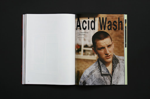
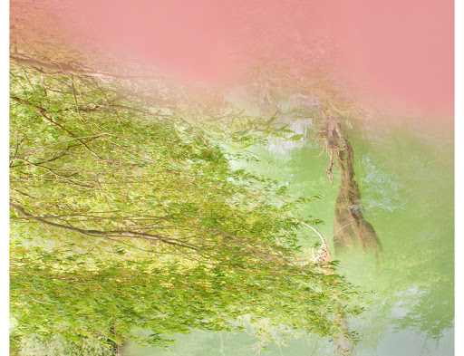
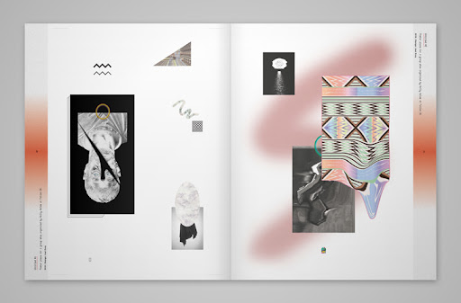
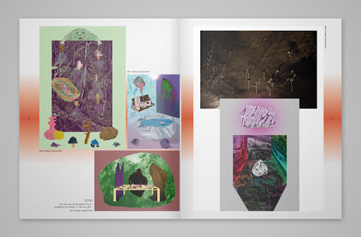
Aesthetically speaking, certain visual effects are always repeating. So you have the Photoshop gradient, and the airbrush, and using that gray-and-white checkered Photoshop background. Then it’s using typefaces like Arial or Times, system fonts that everyone has. I haven’t seen Comic Sans—yet. The origins of that probably lie in the default design movement, which happened a decade ago in Holland. It was really popular to do design that didn’t look designed, using Times and Arial. This movement merged with the New Ugly movement. Then you see a lot this photocopy aesthetic: taking an image and photocopying it and having this bad texture, and sometimes moving the images while you’re copying them. This was done a lot in schools in the ’90s as an exercise, with photocopy machines. Nowadays since most of the young designers don’t have access to a photocopier, they do it with a scanner; in the book there’s a designer who refers to Renaissance paintings by putting roses on a scanner and moving them (above top), so you have this idea of nature against the artificial. The New Ugly movement really encompasses everything considered ugly, so using a Greek sculpture or column, or ’80s colors like mint and lilac, or Memphis-like textures as well.


I think everything in the book is beautiful.
That’s why we love the title so much. The publisher told us we shouldn’t tell anyone the title until the end, actually, because they thought the subjects in the book might get offended by it. Which of course wasn’t the case.


What do you think is actually ugly these days?
People still send us stuff trying to top each other in ugliness, but it’s really difficult to make something really ugly. You can do something pointless, or boring, but you can’t say that this is really ugly. This was part of the objective of this movement, to push the boundaries, and to get people to accept things they wouldn’t have accepted before. But what’s really important now is humor, and not taking yourself too seriously. It’s not like a ha-ha joke, and wanting to do funny things, but a kind of self-irony—saying, “We’re not going to take ourselves that seriously anymore. We’re going to put something out there, even if people inevitably say oh you’re such a bad designer, why are you using this font.” It’s a lot about that.

Most people point to Mike Meiré’s redesign of 032c as the turning point for New Ugly. Was that the moment it became recognized as a movement?
I think what 032c were doing by distorting type was certainly part of the New Ugly movement, but the function was totally different. Visually, of course, it was one of the first examples, but now the methodology behind the work is more important. Meire wanted to create an identity that looked nothing like other magazines out at the time; he used the design to differentiate it, but he wasn’t really opening up his process to others. It was a gesture. What you’re seeing now is different. When you look at Metahaven, for example, who did covers for Print magazine and a proposal for the Wikileaks identity, you see this multilayered design, a flexible visual identity that can be worked with in many different ways. It’s like the designer creates a toolbox for the client, and the client can create his own application.

Who else has played a key role?
For one, a school like Werkplaats Typografie, in Arnhem, where Armand Mevis and Karel Martens are teaching. If you go through their students’work, every second piece could be considered part of the New Ugly movement. A lot of people in Pretty Ugly did their postgraduate degrees there.

What work in the book do you think the average person would find the most jarring or confusing?
Maybe Andreas Ervik’s illustrations—in all the other pieces you can understand what the objective of the designer is, what he or she wants to express, but his work is really hard to read. A lot of the works in the book, if you see them for the first time, you might wonder if it’s actually design. In the context of the book, it’s obvious, but if you only saw one work in the context of everyday life, you probably couldn’t tell if the designer did it ugly on purpose or not, or whether it was done by an amateur. Most of the designers are trying to look amateur, and working really hard to forget everything they know. If you look at the books that Rob van den Nieuwenhuizen did for Onomatopee, for instance, he’s doing everything a good typographer would do, but then deliberately making it hard to read.

I think some people would be surprised to find that you included examples in the book that aren’t graphic design.
The graphic designers are maybe the most mainstream examples, but there are fashion designers who are doing even more interesting work within the movement, precisely because they’re not graphic designers — when they do illustrations, then it’s really getting ugly. They work a lot with textures, so at the end you don’t see anything anymore of their clothes, you just get a feeling for their work. Fashion designers like Andrea Crews often create two different presentations of their works: one normal shoot where they just present their line, and then a more abstract shoot. There’s also a New Ugly strain in industrial design, and we could have found examples in architecture as well. We really wanted to make this a fluid mixture between all the different disciplines. It happened in all of them at the same time.


That’s when you see that it’s a real movement — because it’s happening everywhere. It’s not just Mike Meiré who started something and everyone thought it was genius. It’s something that people felt the need for, to do something different and do something considered ugly, at least in the beginning. Everyone’s constantly trying to push the boundaries of what their profession is, and what they learned at school. Everything goes in waves. We went from strict rules to loosening up the rules, and most likely after that we’ll return to something strict again.

What rules people were they reacting against, exactly?
One of the most obvious is that typography is holy, and you never would choose any system typeface, or use a Windows program to design something. Within my personal experience, it all makes sense. We both studied in Darmstadt under a Swiss designer, and we learned the Swiss design rules, or really the German-Swiss design rules. Our professors were very strict about typefaces—you could use Univers, Frutiger, Helvetica, or if you wanted to be classic you could use some serif typefaces like Garamond, but these are all properly drawn typefaces. It’s not like someone who has a PC and needs to do a party flyer for his daughter’s kindergarten, with a bad version of Times or Comic Sans, and because he needs it really big, he stretches it to fill the whole page. Doing something like that was totally forbidden. And yet at that moment you still think you have all the freedom in the world—and then Mike Meire comes along and does this stretching typefaces thing that you’ve seen before on record sleeves like Gangstarr, or some ’90s bands, and then you see it in a magazine that’s supposed to be for intellectuals, and it feels kind of shocking. To many of us it was actually just shocking that there was still something to shock with; a big part of the attraction to that style comes from the fact that designers considered to be good broke rules we didn’t even know still existed.

What’s the status of the New Ugly now? Is it trendy? Is it becoming passé?
If a certain style gets popular, it inevitably becomes a trend, and then it starts to become empty. What’s more interesting is what the designers were actually doing when they were practicing it. Yes, it’s a trend now—when we were doing our research, we had over 120 people participating, and our first version had 900 pages and was very difficult to boil down. So you can see that it became a massive trend for young designers. Having Metahaven doing the covers of Print magazine—that wouldn’t have happened five years ago. It’s not mainstream, of course, but for many people inside the design world it means something’s established, you’re not just a freak anymore. There are people that accept what you’re doing. There’s also the work of Zak Kyes, who designs all the publications for the Architectural Association school in London, and of course Urban Outfitters. A lot of people in the book, like Joel Evey, have worked for them, and they did pretty trashy things for them as well. But we thought that now was a good time to make this book, because first you get a distance to what happened over the last 10 years, and then it’s to the point that it’s really interesting, and you start learning from it. We think that in a few years people will become tired of it, and the ones that are most interested in it will try to get distance from it and do something new again.

When that happens, what do you think will be New Ugly’s lasting effect?
You can’t go back anymore to a non-context-driven version of design, because this is the time we live in. Everything we do has an immediate response. Look at the social networks, and how institutions move inside these social networks—it’s not anymore one static message sent out by a company, you have to be much more flexible in the way you’re reacting. Seeing design as a process is a movement that can’t be stopped.
What one day will stop is this kind of anti-aesthetic; people won’t consider this as ugly anymore. They’ll get used to it, and they’ll need something else to move on to, something else to excite them. It’s really hard, even now, to do something ugly. Designers were fighting so hard to destroy the last rules in design, but it’s not that interesting anymore to fight against the established rules, because there are no rules anymore—everyone can do what he or she feels like doing. And this type of typographic treatment that you see now, with stretched typefaces, it actually all happened before. If you look at record sleeves in the ’80s and early ’90s, it was already there. In this New Ugly movement you also have a lot of references to Memphis design. Most of the people working with these kinds of elements weren’t even born at that time.
Lupi and I see a lot of repetition there. Of course it works, because some time has passed and it’s new again, and of course the young designers do different things with it. Times have changed, and the message has changed even though the aesthetics might be similar. So it’s working, in a way. But we think it’s pretty clear that one day there will be overload of empty messages using these aesthetics and people will get bored. You’re already starting to see some of the Photoshop effects and visual gestures repeating over and over again, and there’s less and less space to explore new things within the movement. The more they’re repeating, the bigger the feeling grows that this will come to an end.

Interview from sightunseen

Pretty Ugly by TwoPointsNet


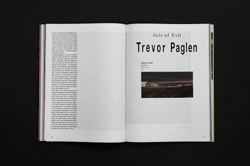
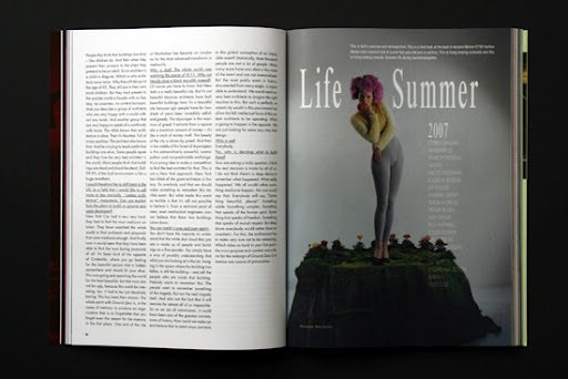
While art was allowed to be ugly, design had to function. Although for hundreds of years new artistic styles were established through aesthetic upheaval, new trends in graphic design and visual communication were, until recently, variations on what was generally considered to be appealing. But in the last few years, those working in these creative disciplines started to rebel. Dada-esque graphics or unreadable typography began to be used as a way to claim a unique style advantage.

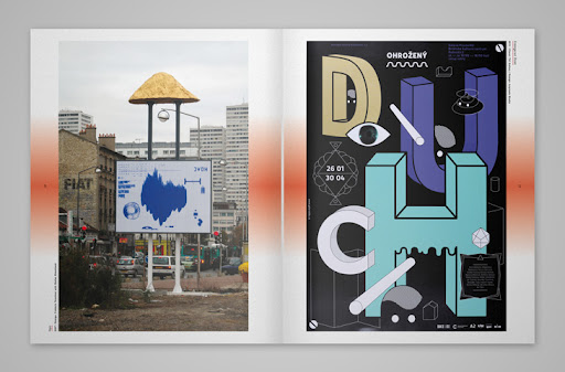
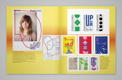
“Pretty Ugly” is a diverse collection of these recent aesthetic, methodological and conceptual rampages not only in the fields of graphic design and visual communication, but also in product design, fashion design, art, and photography. The originators of this work consciously use unusual or negatively perceived forms, colors, and perspectives or transgresive process in an attempt to blaze new creative trails.

The variety of examples in “Pretty Ugly” may still be considered by some to be ugly, but they are already influencing the vanguard of tomorrow’s design.

Buy it HERE.