Now facing the threat of demolition, the AR recalls a time when Graves’ project was set to become ‘Portland’s Eiffel Tower’
Originally published in AR November 1983, this piece was republished online in January 2014
Architecture in an age of brouhaha and hype requires new and different standards of evaluation. Buildings become more than buildings, advance publicity invests new works with almost impenetrable cloaks of significance and meaning. Few buildings in recent years have been as subjected to this process as Michael Graves Architect’s Portland Public Services Building: the airline magazine that displayed an elevational drawing on the cover and proclaimed ‘It’s the Building of the Future’ is perhaps the most extreme example, but hardly atypical of the interest stirred by Graves’ design.
But what all the uproar conceals is a work firmly planted in a well-established tradition of urban architecture that vanquished its competition rivals simple because it was cheaper to build. This is not to say that the design is humdrum or uneventful; the squat box of the Portland building with its regular rows of square windows and over-scaled Classical elements is unquestionably striking. But does it actually point new directions for architecture at a time when new directions are desperately sought?
The history of Graves’ design is critical to any understanding of what has resulted. The commission was won in a limited competition against Arthur Erickson Associates and Mitchell Giurgola Architects. A citizens’ jury, advised by Philip Johnson, voted 4-1 to recommend the Graves design to the city council, but it was not just Johnson’s ‘imprimatur’ that swayed the jury. The project managers had recommended Graves’ work, 12, to them because they thought it would be the cheapest to build, had the most square feet of usable space and was the most energy-efficient. The city council voted in Graves’ favour, but the uproar created by the opposition forced a run-off between Graves and Erickson.
Graves was asked to make a number of revisions: his original roof-top structures had to be removed, as well as the stature of Portlandia and the garlands; two floors had to be added, the exterior changed from stucco to concrete and the windows increased in size from 3ft square to 4ft square. Graves won the competition a second time. He subsequently managed to win back a number of the concessions, notably the statue and garlands. A building of simple construction, it was finished on time and on budget this autumn. At $51 per sq ft, it is a box with decoration and little more. But it is those decorations that have created the stir.

Seen from across the Willamette River, the Public Services Building must compete for attention with the rapidly growing number of sleek towers in Portland’s downtown. Its squatness sets it apart, but it is the colour of the keystone in particular that stands out, mimicking the warm, brown tones of some of Portland’s older buildings. The garlands just peek out over the tops of some nearby buildings, while the blue penthouse storey blends into the backdrop of pine-clad hills. But closer up the impact is far stronger.
From Fourth or Fifth Avenue the wedges of the pilaster ‘capitals’ jut boldly out, while from the park across the street, the garlands seem to be pinned on like enormous military decorations. And on the frequent grey, rainy days in Portland, the colours and simple forms retain their effects, A tripartite division into foot, body and head is clear (although the sadly cut roof-top pavilions would have made a far more glorious head). As has been pointed out by other writers, and anthropomorphic metaphor is particularly appropriate in a building housing the representatives of the people.
A pedestrian colonnade lines three sides of the base; shops and the lobby entrance stand inside this loggia. Covered colonnades were traditional in the cast-iron buildings of nineteenth-century Portland; in the often inclement weather, proving and inside/outside area is practical as well as aesthetic. But Graves’ colonnade has none of the grace of its nineteenth-century predecessors; the chunkiness of the building has manifested itself in the low, overly broad proportions.
Sitting atop the base, above the Fifth Avenue entrance, will be the sculpture ‘Portlandia’. As is the case with many public commissions in the United States, 1 per cent of the building budget is set aside for ‘art’. Graves proposed ‘Portlandia’ (formerly –ie pre-Graves – ‘Lady Commerce’), and after considerable wrangling with the city council, approval was given for a sculpture competition. Two finalists have been selected and a winner should be announced shortly. Apart from the symbolic value, ‘Portlandia’ should animate the transitional zone between base and body.

The body is far more coherent that the foot. The march of square windows provides a disciplining grid, but also evokes images of the regular bureaucracy lying behind. The pilasters supporting the keystone are meant to suggest the internal programme – city offices below support commercial activities above in rental offices – but changes in Portland’s governmental needs could well erase this symbolic nicety.
The reflective glass used to surround the pilasters and capitals is one of the less successful elements: it succeeds in defining the centre of the building, but its perfectly smooth appearance lack the strength the texture of the rest of the exterior. The garlands are an enjoyable touch of whimsy, although the simplified design (for cleaning purposes) lacks the exuberance of the original glowing swags. The cropped head is but a pale reminder of the pavilion-populated roofscape of the original drawings. A rectangular box containing services rests inside the square of the penthouse floor. In place of the small pavilion perched on a ledge with views towards Mount Hood, Graves had to settle for a bare ‘baldacchino’ flush with the exterior of the building.
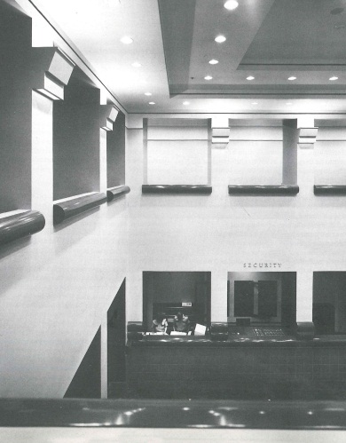
Inside the building is by no means as lively. On the first two floors, however, the budget did allow some scope for the designer. Graves’ palette of cool pastel colours conveys a subdued, elegant feeling in the entrance and double-height lobby. In the lobby up/downlighters serve as column capitals. The lobby is paved with black terrazzo tiles. Other accommodation on the ground floor includes six commercial shops, a coffee shop and a city building-permit centre.
The first floor contains three meeting rooms and an art gallery in the area overlooking the lobby. The offices themselves, Graves admits, are standard spec offices. Yet it is in the offices that the discipline of small, square windows has the greatest effect. The windows, in contrast to a modern window-wall, frame all views, making certain the distinction between inside and outside. Even behind the blank reflective glass the square windows have been imposed; an opaque screen creates the disjuncture between exterior appearance and interior reality.
But is there anything strikingly new about the forms of the Portland building? A decorated urban box has clear antecedents in the United States, particularly in the Art Deco skyscrapers of the ‘20s and ‘30s. And much about the Graves design recalls the Art Deco work: frills on the outside, the aesthetic carried into the lobby, but the offices standard issue. The soaring quality of the Art Deco skyscrapers is quite dissimilar, however, to the strong squatness of the Portland work.
The jazz age has given way to something more stolid, phlegmatic, something more atuned to the spirit of a conservative city in an increasingly conservative country. In character Graves’ building is closer to the weight of the Beaux-Arts works of McKim Mead & White than to the exuberance of the McGraw-Hill Building. But there is something added to the Classical tradition in Graves’ design, a certain freedom of form and decoration which brings it closer to the European tradition of the Viennese Secessionists Hoffmann, Olbrich and Wagner.
Wagner in particular was wedded to Classicism, but in his grand, never-realised schemes for large public buildings in Vienna he cloaks designs in swags, floriated decoration and odd, Neo-Egyptian sculptures. Rather than heralding a radical new, Post-Modern age, Graves is continuing renewing a style from the early years of this century. If there is any need for labels, the Portland building is Neo-Viennese instead of Post-Modern.
So the Portland work is not The Building of the Future, but a lively descendent of many buildings of the past. The storm of publicity surrounding the design has not magically transformed it into a revolutionary work. Its significance is not lessened for that. In common with other works – the slick Deco of Helmut Jahn in Chicago or Philip Johnson’s much-ballyhooed historicism in New York, Houston and Pittsburgh – Graves is making a break with the Modern box tradition of the middle years of the twentieth century and returning to an older urban tradition.
The design may lack some of the fluency, the accomplishment of its forebears, but all pioneering works risk this failing. The mayor of Portland, Frank Ivancie, has said he believes Graves’ building will become Portland’s Eiffel Tower – an emblem of the city which will draw the curious from around the world. Enjoyable, striking, controversial, the Public Services Building has the qualities to become a potent symbol of Portland.