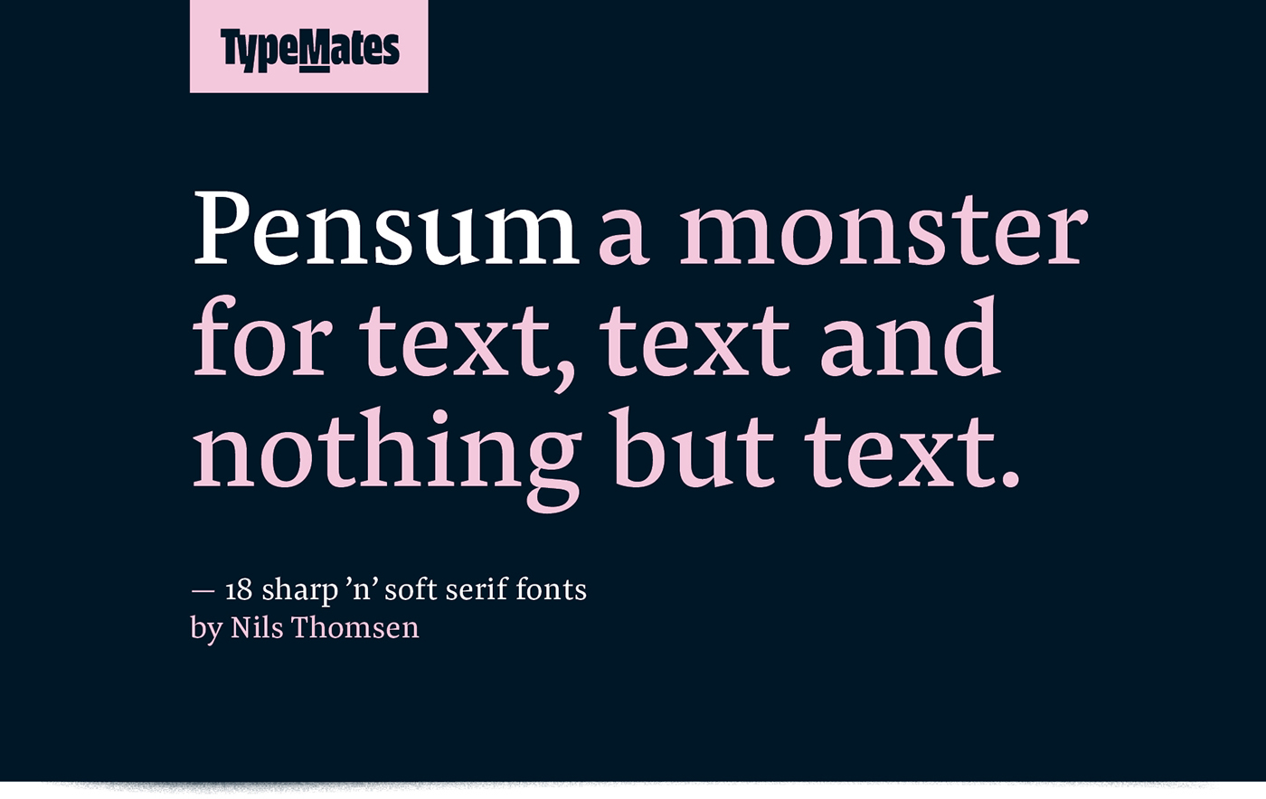
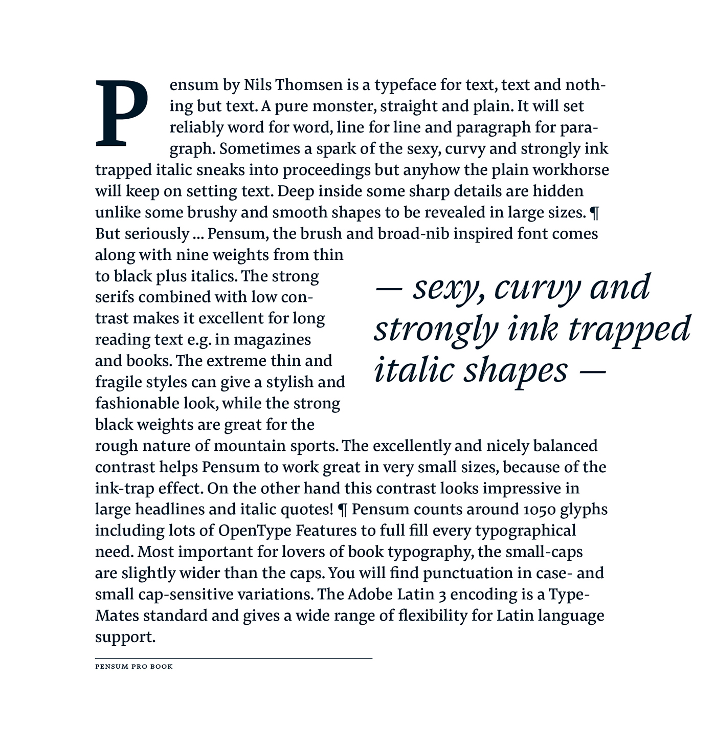
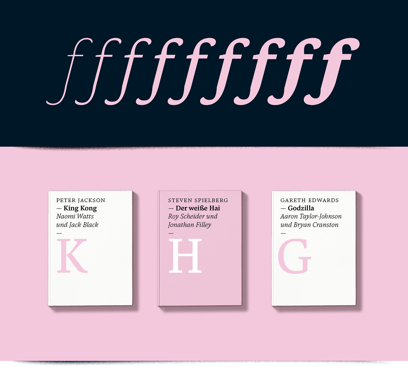
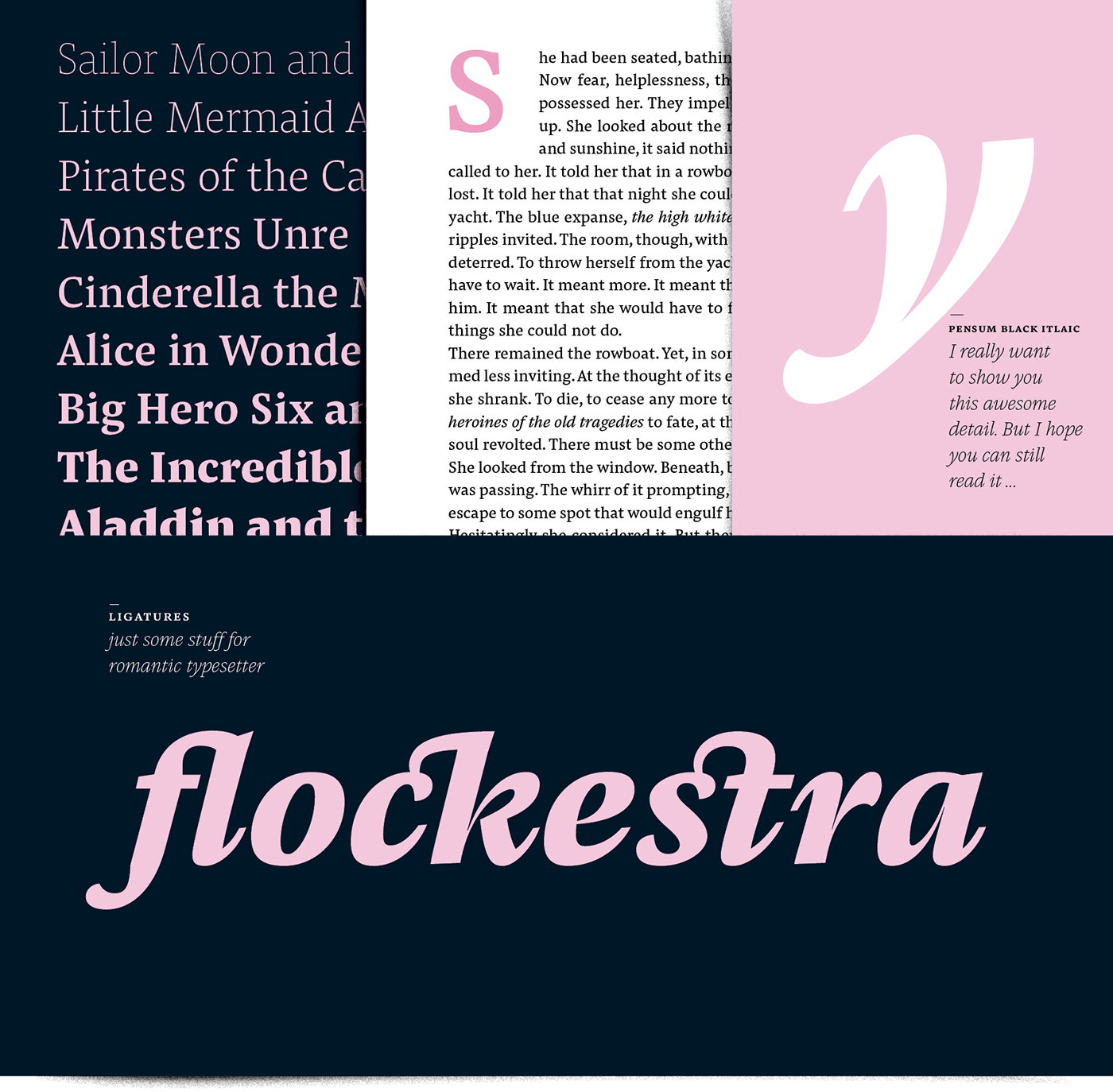
Pensum by Nils Thomsen is a typeface for text, text and nothing but text. A pure monster, straight and plain. It will set reliably word for word, line for line and paragraph for paragraph. Sometimes a spark of the sexy, curvy and strongly ink trapped italic sneaks into proceedings but anyhow the plain workhorse will keep on setting text. Deep inside some sharp details are hidden unlike some brushy and smooth shapes to be revealed in large sizes.
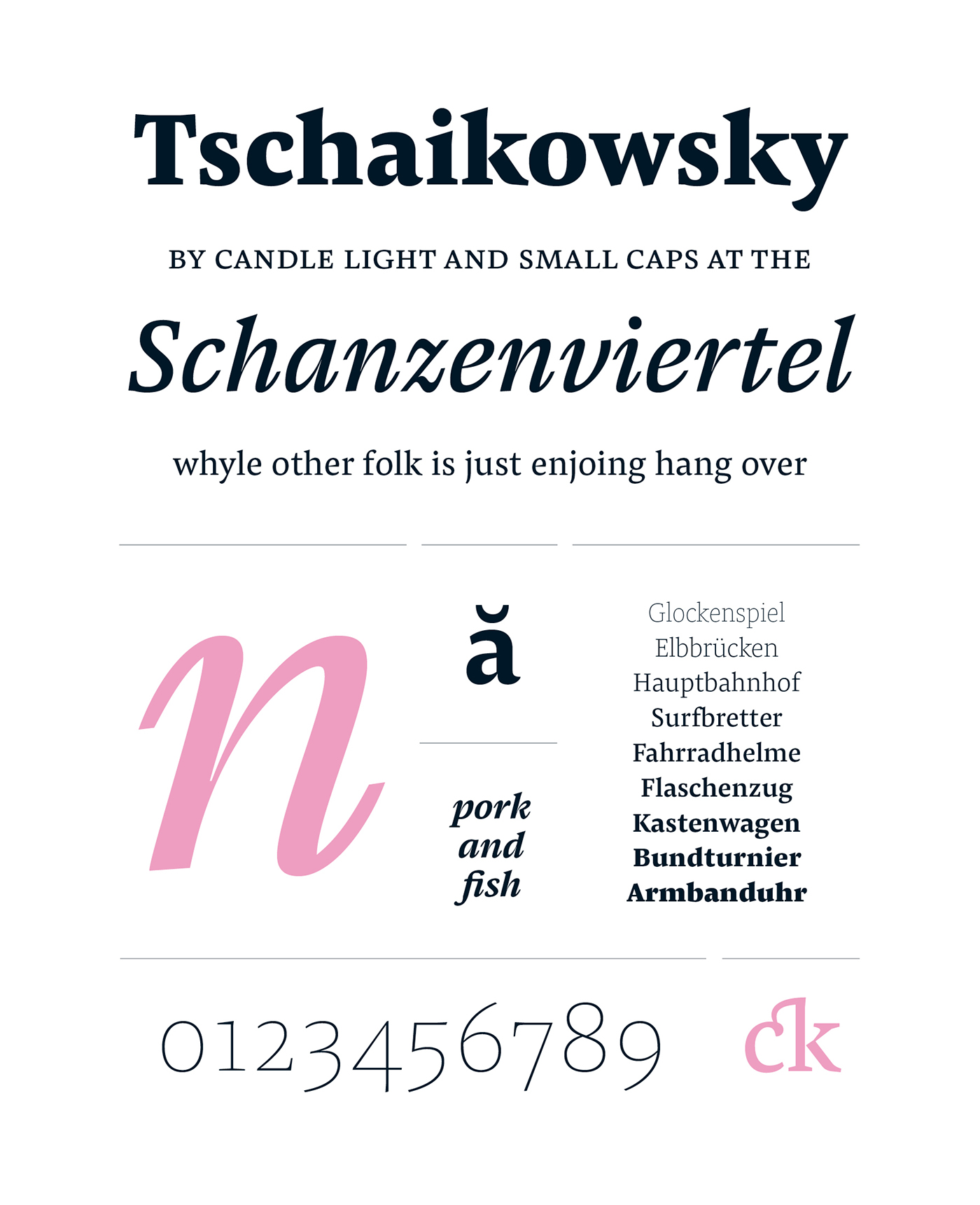
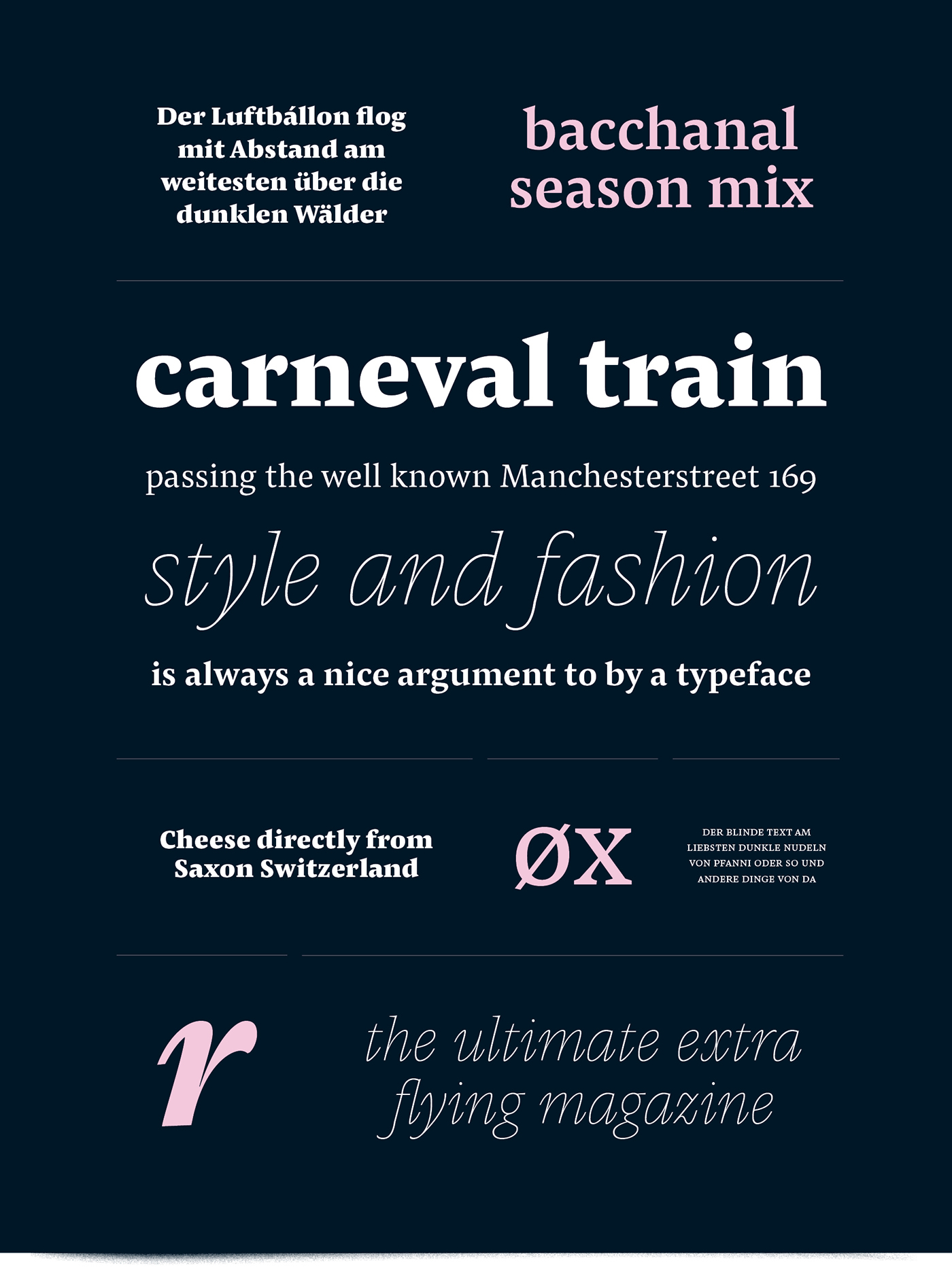
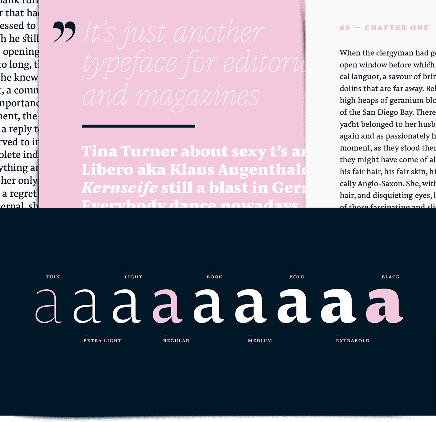
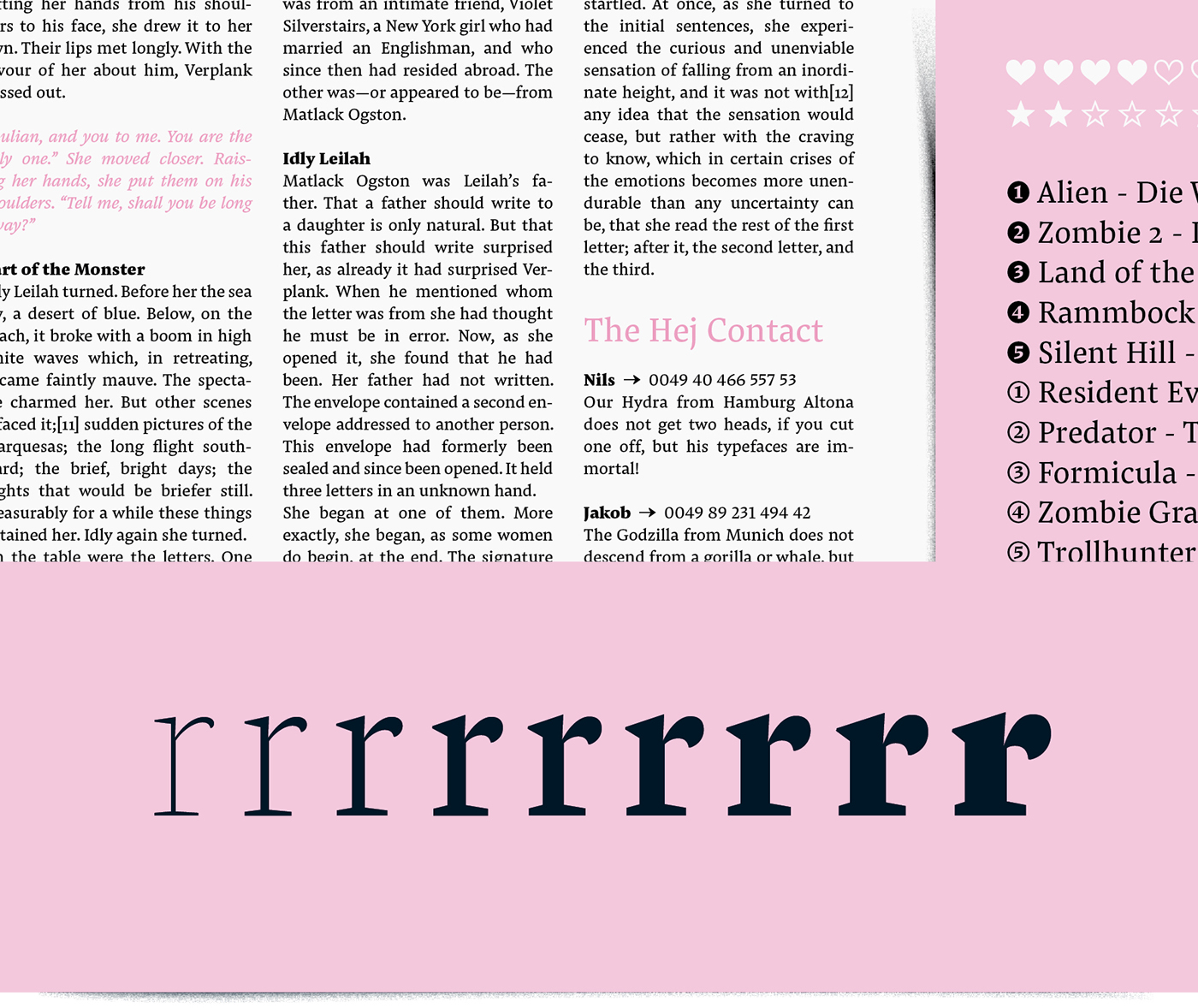
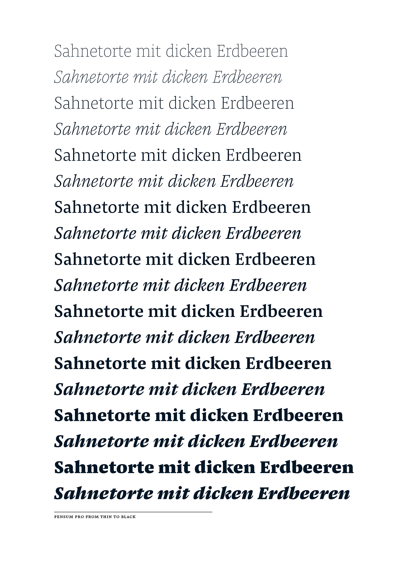
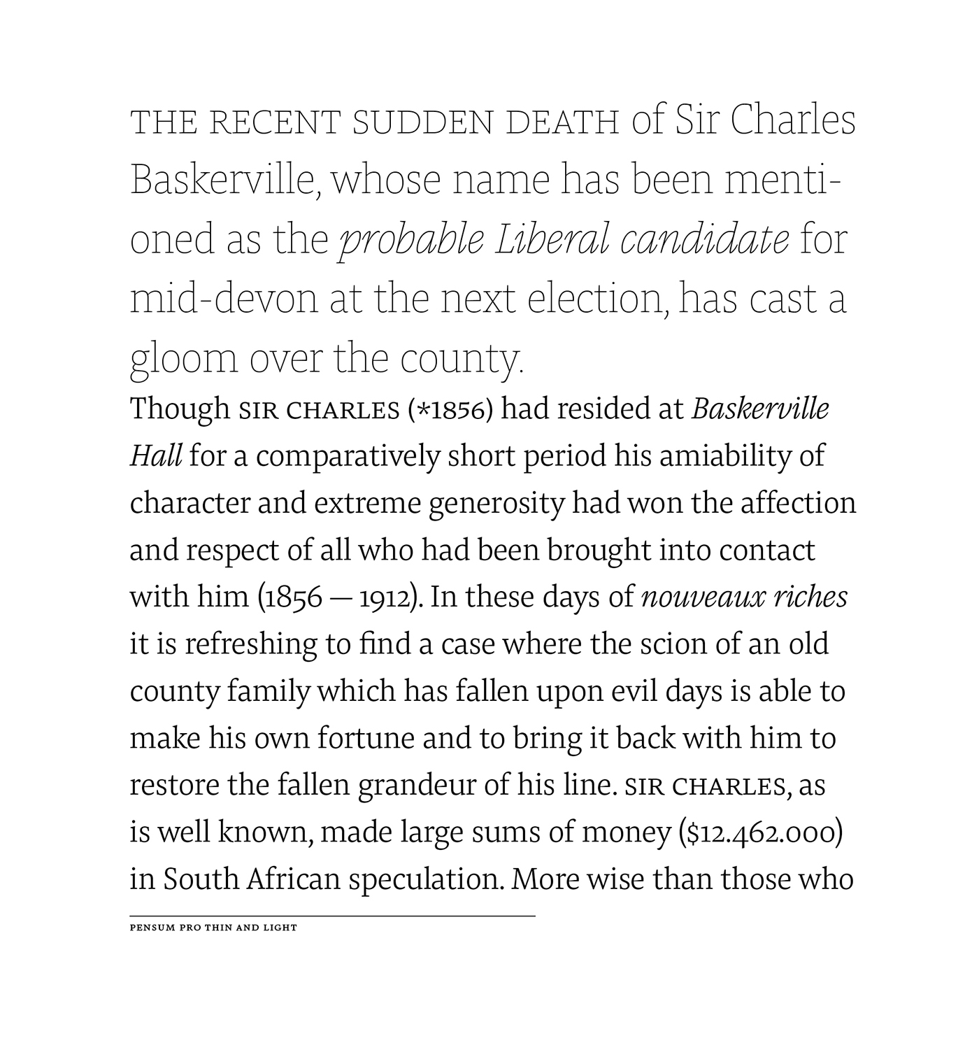
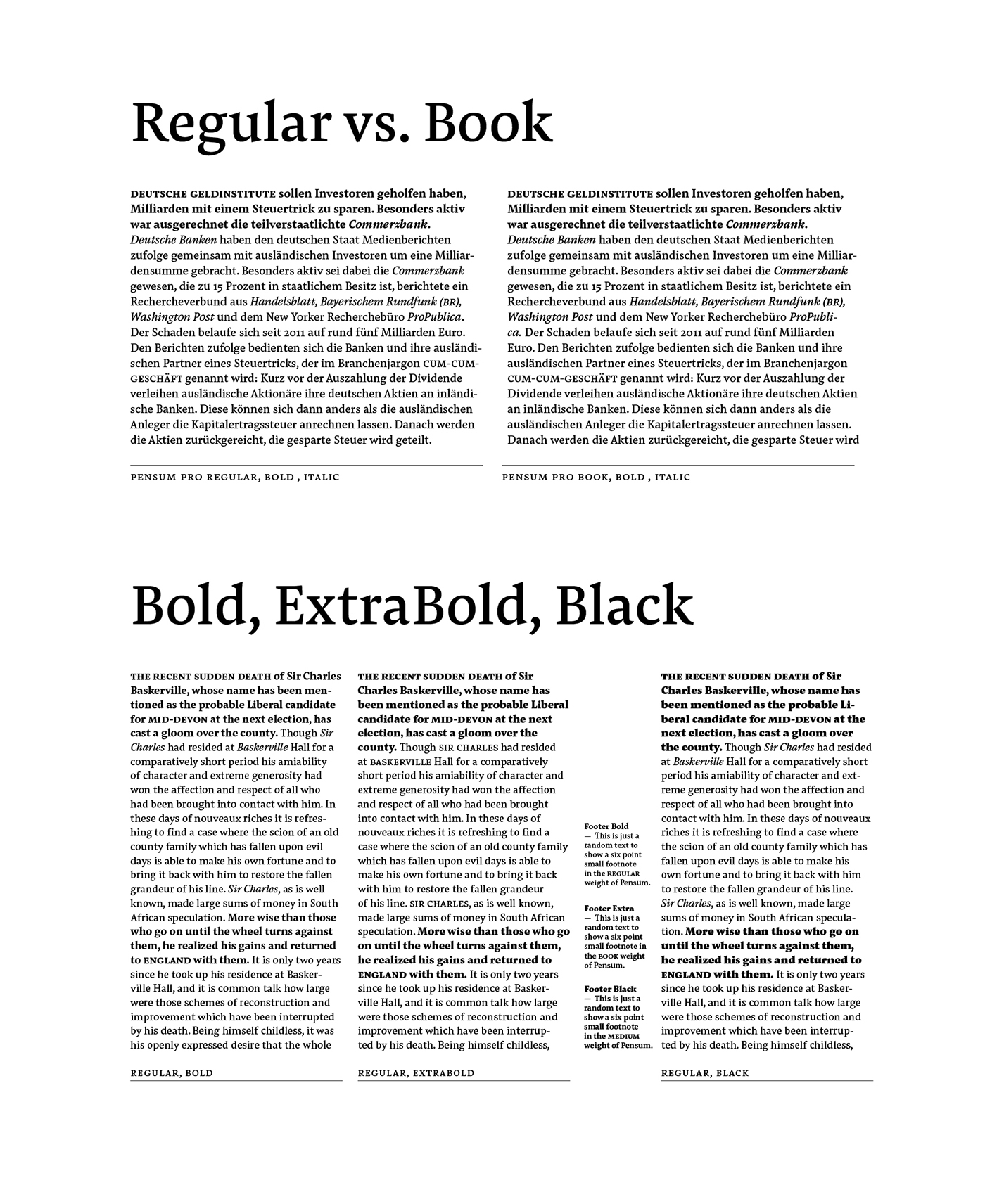
But seriously ... Pensum, the brush and broad-nib inspired font comes along with nine weights from thin to black plus italics. The strong serifs combined with low contrast makes it excellent for long reading text e.g. in magazines and books. The extreme thin and fragile styles can give a stylish and fashionable look, while the strong black weights are great for the rough nature of mountain sports. The excellently and nicely balanced contrast helps Pensum to work great in very small sizes, because of the ink-trap effect. On the other hand this contrast looks impressive in large headlines and italic quotes!
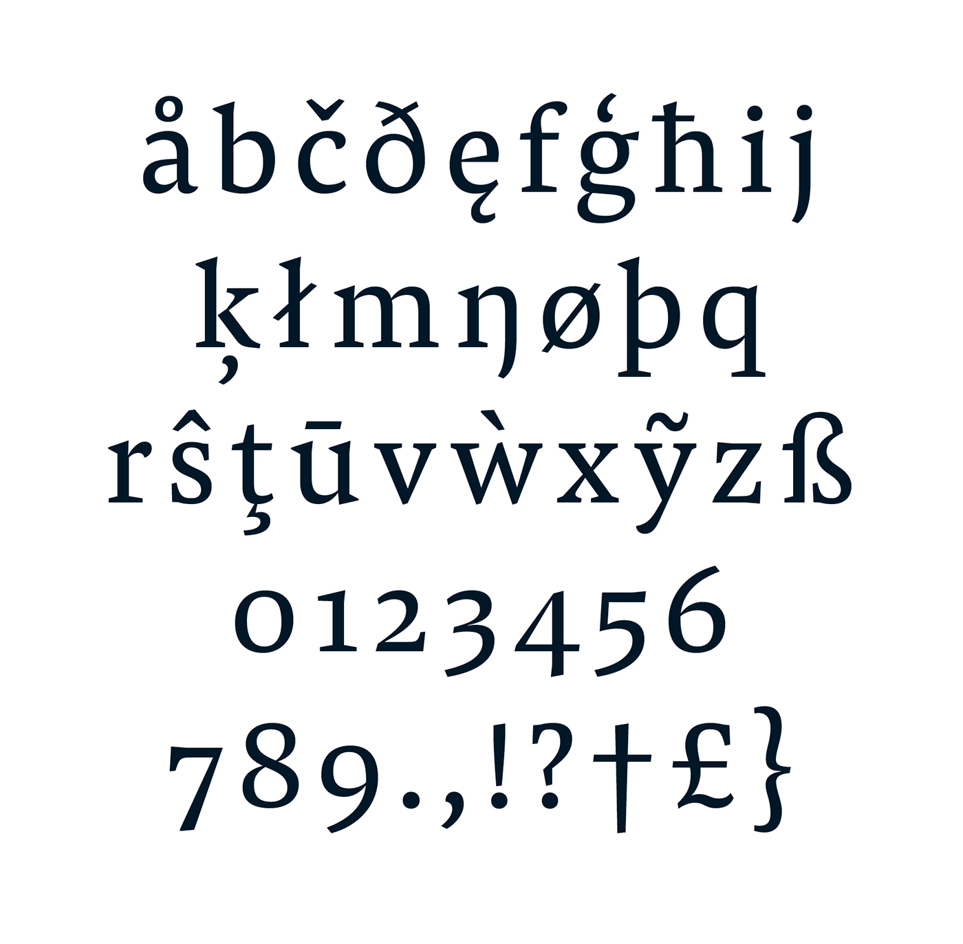
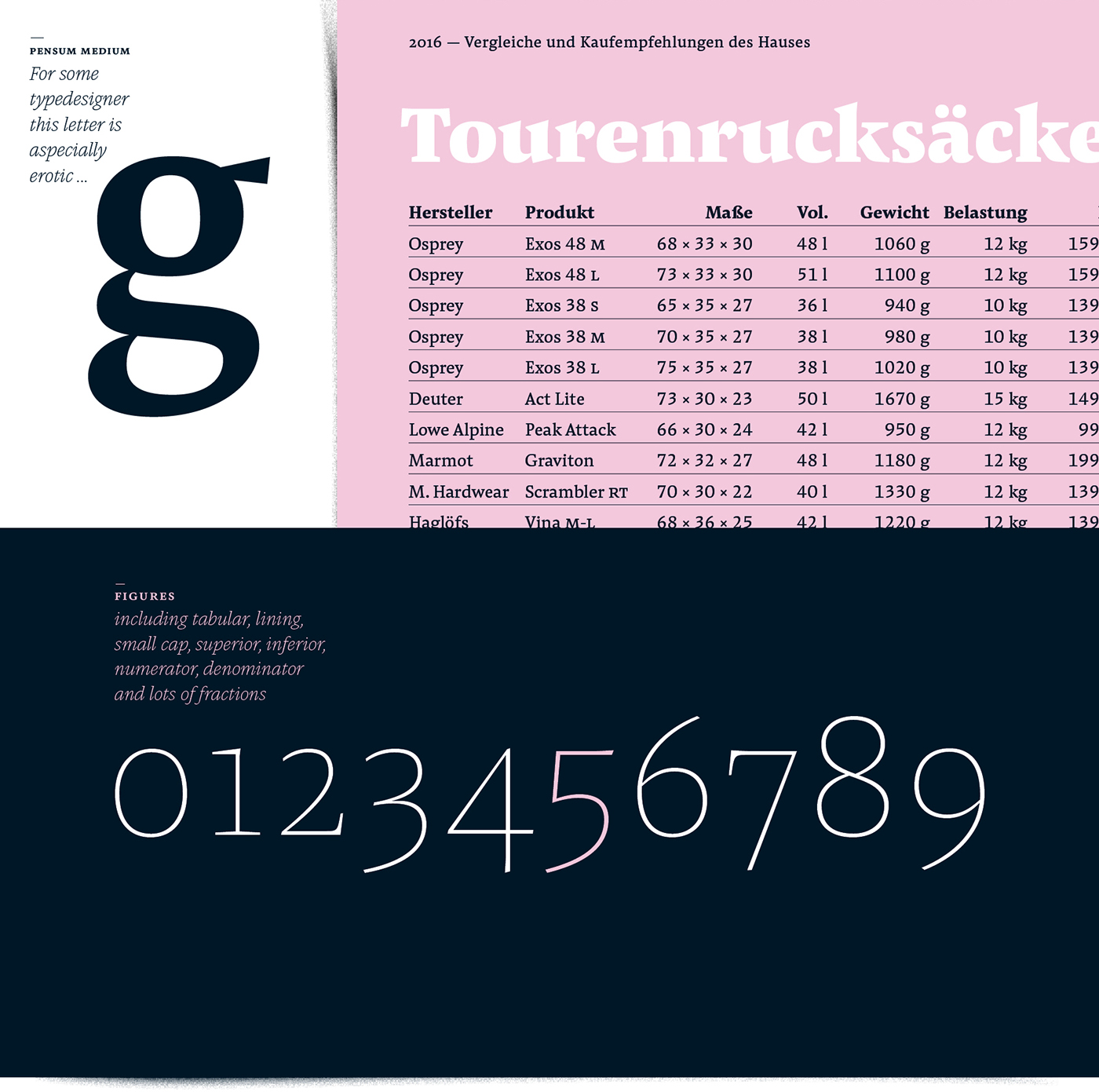
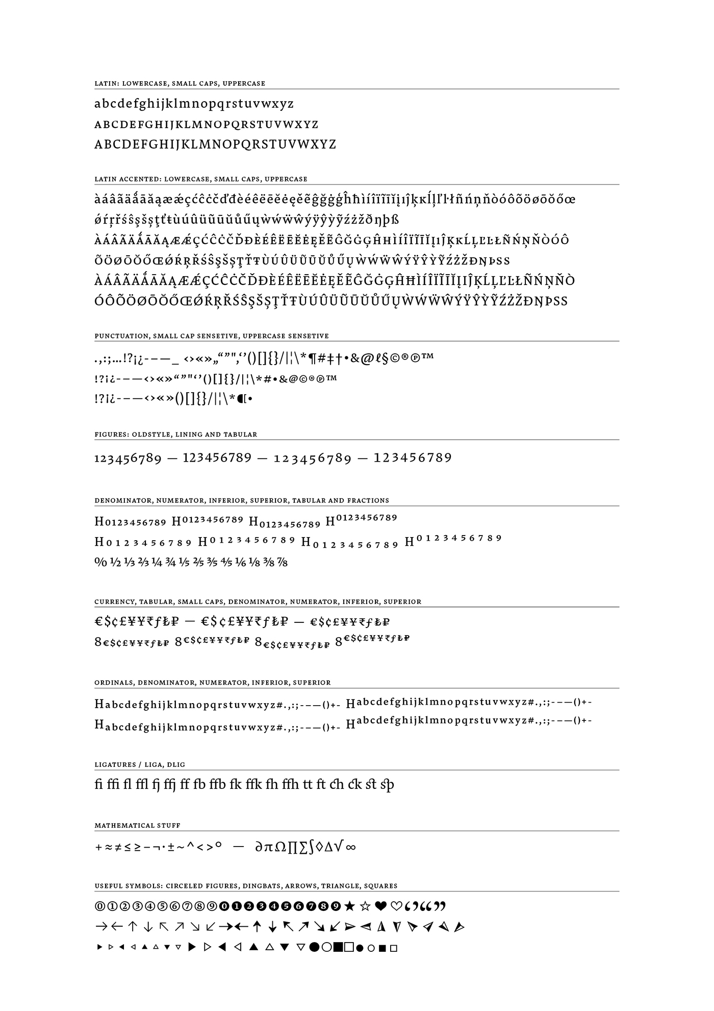
Pensum counts around 1050 glyphs including lots of OpenType Features to full fill every typographical need. Most important for lovers of book typography, the small-caps are slightly wider than the caps. You will find punctuation in case- and small cap-sensitive variations. The Adobe Latin 3 encoding is a TypeMates standard and gives a wide range of flexibility for Latin language support.
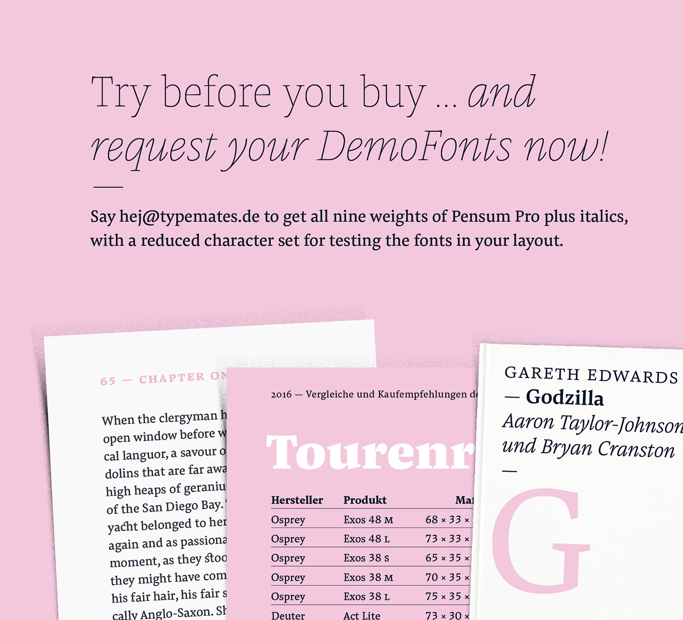
Download Pensum DEMO for free: www.typemates.com/fonts/pensum-pro
Visit typemates.de to explore more typefaces
or subscribe our newsletter for new additions like Pensum Sans.

