
Artist: Erik Sandgren (lead artist) with Anthony James Cotham, Dominic Senibaldi, Jason Sobottka, and David Wall
Images courtesy of the Daily World
Nirvana and Aberdeen
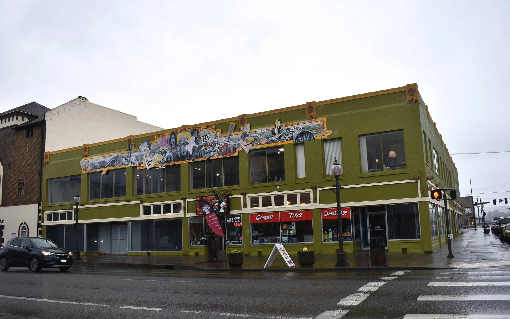
Location: Corner of South K & West Wishkah, facing Wishkah Street
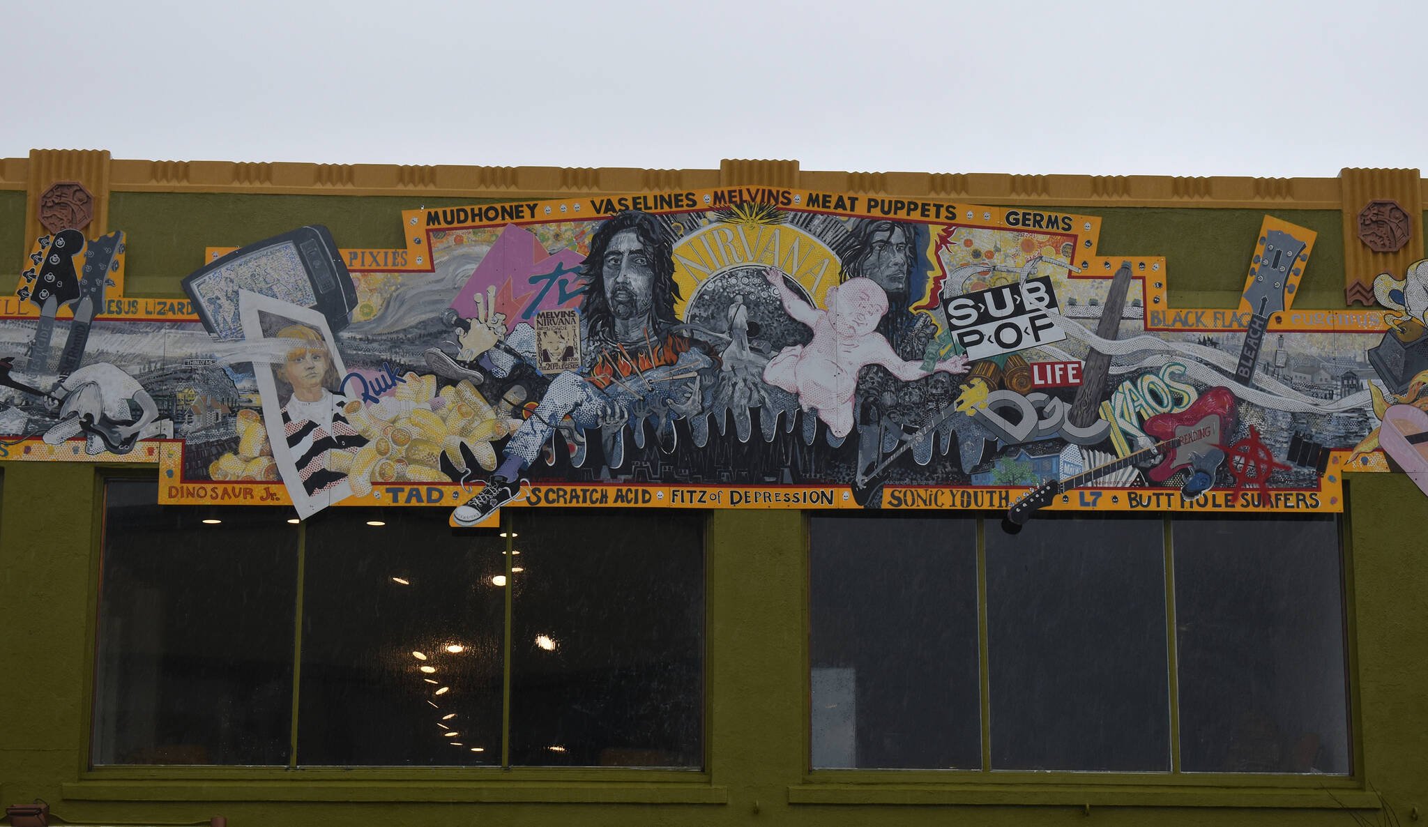
A mural depicting images associated with the band and its genesis within the context of Aberdeen’s history at the time.
Artist’s Statement: (Erik Sandgren)
This project began in June of 2013 with an invitation from Our Aberdeen to consider doing one of two outdoor mural projects for the community. I was to choose between the subject of Historic Aberdeen or Kurt Cobain. Instantly my response was that I would be interested in doing both at once. I wanted to place the music squarely in the landscape where I had now lived for a quarter century. It was that first moment of insight about the context, nexus and matrix of the Harbor as the birthplace of Nirvana that has directed the following twelve months of research, musing, conversation, drawing, inspiration, fundraising, listening and planning.
My second realization was more gradual: that the mural really had to be about Nirvana as a group: about the miracle of their music as a confluence of many people, strands and influences. I began a search for the subject matter that would best suggest that and, through a series of drawings and collages, I sought a visual structure that could absorb the detail and convey the flow across a format dictated by the building itself.
That Aberdeen was central to the development of the music was made abundantly clear to us by author Charles Cross when he visited the Aberdeen Timberland Regional Library in connection with the publication of his latest book on Cobain. In response to a question from the audience, he stated emphatically that Aberdeen owns Grunge – and that it should be celebrating that history. For me the context is properly the Harbor itself including Aberdeen: ALL its communities, economies, weather, look, history and reputations. The real mystery is how the music grew out of the place – a particular alchemy of emulation and rejection.
I came to town in 1989 to be the one-person Art Department at Grays Harbor College. As relatively young faculty, I was impressed with the quality and work ethic of many of my students from here. From what does all this talent spring? The local music scenes were in the deep background for me. Then all of a sudden Nirvana was everywhere and almost as quickly Kurt was gone. I saw more tribute graffiti about him in Europe than here; obviously, something special had happened. Most people missed it in the event. In musing about my relationship to the music, I soon realized that the mural needed the addition of younger visions and voices. I wanted to work with artists from the Harbor who had heard that music earlier in their lives. As the backing for the mural project became more tangible, I reached out to artists from the Harbor who had worked with me before: David Wall, Anthony James Cotham, Dominic Senibaldi, and Jason Sobottka immediately accepted my invitation to work on the mural. We began months of trading sketches and ideas via cell phone texts and e-mails and then set up for one month of the intensely physical work of laying out the preliminary drawing and painting it on this scale. The mural is imbued with the spirit of former students, now colleagues who are deeply familiar with the place and the music. Each brought a different and necessary skill set to the project. We worked in the second-story space of the downtown Electric Building, generously made available to us by owner Kevin Moore.
This teamwork has culminated in a 68-foot long mural designed for the Wishkah Street side of Moore’s Interiors. It is executed with durable One Shot enamels on Di-Bond panels installed by Rick Burgess of Coastline Signs. The collage of imagery recognizable to those who know the music and its milieu was first laid out on the panels in soluble stabilo pencil, then the quick-setting enamels were applied by brushes, air brush, printing, stippling and hand-cut stencils. The five artists together put in about 650 hours of painting time.
The mural is not an apology. It is not fan art; it is not a justification; it is not hero worship; it is not Seattle. It is not about Kurt Cobain alone, though it acknowledges his tragic arc; rather, it memorializes Nirvana as a group – to some extent its present state and mostly references the Harbor here where it all began. It recognizes our All Stars, alludes to the price paid for their success, and asks us to “Think of Me.”
One cannot get over the sad and sorry loss of Kurt Cobain. His train wreck of a life contrasts poignantly with the ongoing vitality of Dave Grohl and Krist Novoselic as people and musicians. As I sorted through material looking for resonant imagery, the problem became what to leave out. There is so much to know and feel. Several things gradually became crystal clear to me about Nirvana that seem also be true of other significant art and artists: the root appeal of the artists’ emotional honesty; how brief a moment was their glory; how the art grew without money from the mud, noise, and need to escape; how they went all-out with the blind faith of crowd surfers leaping into space; and how problematic it is to craft attractive structures out of fundamentally disturbing material.
For me the imbedded contradictions that characterize great imagery are right there in the music. Nirvana so obviously fuses incommensurable opposites that nearly everyone gets it: attraction/repulsion, loud/soft, melodic/chaotic, vulnerable/aggressive, grunge/pop, fast/slow, wanting success/rejecting popularity.
The mural began to take form as a layered collage of visual facts unified by horizontal flow. Bright color areas alternate with zones dominated by black/white/grey that suggest the verse-chorus-verse contrasts of a recognizable musical pattern. Overlapping text, logos, signs, symbols, objects, portraits, landscape spaces, musical instruments are densely packed in a border of school-bus yellow. Transgressive elements break the boundaries here and there. The red stripe is Grohl’s drum work: a bright, hard and precise boundary within which everything else can be itself. The border forms a classic triad of color primaries in conjunction with the low intensity blue cladding of the building itself.
The border is punctuated by the colorful names of many bands contemporary with Nirvana in the regional and national scene of indie/grunge music. The Vaselines were Scots but super-important favorites: the central names at top were most significant to them personally. A SubPop poster for Lamefest inspired the dingbats stenciled between the band names.
On the left the flow begins as a stream of memory emanating from the flame of a BIC lighter held by a concertgoer. It merges with the industrial steam from Chehalis river mill stacks and extends as fog and rain over the Harbor. It moves into Think of Me Hill and right on through a photo of sweet, young Kurt into the chaos of the central zone. Piled around the photo are ingestibles, cigs and Mac’N Cheese. Kurt would drink strawberry Quik to try and settle a painful stomach. Quik mirrors the logo of Life opposite it on the mural: his life was too quick.
On the right-hand side, the flow is maintained by the laces of the iconic Converse All Stars repeated elsewhere. The ambiguous Chim Chim from Cobain’s toy collection plays manic cymbals in front of the Satsop cooling towers and over Grohl’s drums: “Chaka” appears on his bass drum in the first big MTV video: that has its own story. The busted guitar evokes the violent conclusions of many performances. Distortion pedal knobs morph into clear-cut stumps moving up toward Screaming Trees. A funky Grammy award floats over a Harbor mill and hilltop radio tower. The Stargazer lily was Kurt’s over-the-top favorite flower and completes a pile of organic shapes.
The large central circle reprises the structure of the building: there was a round medallion set there in the original masonry. This curve creates the golden arc of Nirvana. In the very center of everything there is a dark hole. This is the form of a vinyl record but the label is a deep void in which a relatively small Cobain turns his back on us and faces the audience and brilliant white stage lights.
We are essentially missing Cobain – the presence of his absence. Flanking the center are large portraits of Novoselic and Grohl. A sequence of brightly colored profiles leading up to the portrait of Grohl is a nod to the previous drummers of Nirvana. Stage lights shimmer on either side.
Below are the wanting hands of adulation. Helping hands support the crowd surfer as a Saint Sebastian with flames and drumsticks as the arrows of martyrdom. They float above the sharp silhouette of a tuttle-toothed saw – the so called “misery whip” of early Harbor loggers.
Left of center two expressive hands grip a microphone that addresses an empty landscape. The voice comes from that place. A flat and pretty MTV logo introduces a chaotic crush of text and imagery. Beyond the wall of a family photograph, a young musician kneels and turns inward. He does not see the logger, the rain, the ridge-top logging, nor the Chehalis River gill-netters. His clumsy hands and impossible headstock nonetheless yield sweet petals of music that fall from the surrounding landscape.
The floating baby and money, of course, is signal imagery from the album cover of Nevermind. In Utero is suggested by the heart-shaped box. Other albums are named throughout: on the amp and guitar necks. Self-proclaimed town curmudgeon Tori Kovach, as is his wont, courageously holds a sign that refers to his own Aberdeen neighborhood, Cobain Landing, and the posthumous album.
Music industry logos punctuate a space on the right dominated by a wood utility pole that typifies our streets. The childhood home and hair salon of Novoselic’s mother morphs into the accordion that was his first instrument. A slim, young Krist chords away to the left on a distinctively low hanging bass guitar.
Finally, the entire length of the mural surface is “defaced”: tagged by the BlackFlag stencil, grafittied with the spray-painted anarchy symbol, plastered with a concert poster, a kicked military boot-print and the safety-yellow sign This Family is Supported by Timber Dollars that was featured on so many Harbor homes and businesses during the hard times of the late eighties and early nineties.
Our Aberdeen generated the funding and goodwill for a celebratory project that gives visible form to some of the feelings the Harbor has for its own music. It brought back to the Harbor a group of successful young artists who worked together under my direction, became friends and made unique contributions to the feel and flow of the imagery. Thank you, Nirvana.
Commissioned by: Our Aberdeen
Sponsors:
City of Aberdeen
Grays Harbor County Department of Tourism
Grays Harbor Community Foundation
Greater Grays Harbor, Inc.
Port of Grays Harbor
Bettie Garbe
Coastline Sign
Barene/Denadel, CPA’s
Michael and Sylvia Dickerson