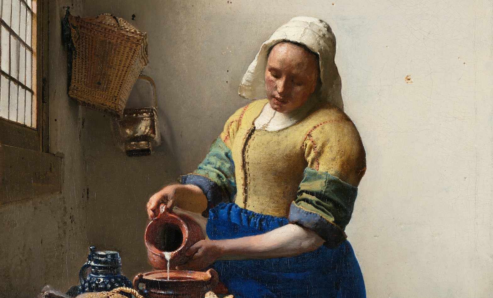
Johannes Vermeer, The Milkmaid, c. 1660. Rijksmuseum, Amsterdam.
After spending a lot of time – in my head, at least – in medieval Italy and 16th Century Europe as a whole, I am looking forward to a foray into the 17th Century, and one of my favourite artists: Johannes Vermeer. In fact, I will be talking about him twice over the next couple of months, a wonderful coincidence about which I am very happy. The first time will be this Wednesday, 17 February, at 6.00pm. I will focus on the paintings in which Vermeer depicts other paintings, and what we can learn from their inclusion. Entitled The Art within the Art, there is still time to book for the talk with Art History Abroad – click on the link for more details. The second will be on Vermeer’s relationship to music, and I’ll tell you more about it another day, if that becomes relevant. As The Milkmaid includes neither paintings nor music, I thought I would take this opportunity to reacquaint myself with what I find to be a disarmingly beautiful image.

I’ve edited the last sentence several times, because I can’t decide whether this painting is disarmingly beautiful. Maybe it’s beautifully disarming – and I’m sure there’s a difference. But why is it either (or both) of these things? I suppose because it is a painting that, for whatever reason, I do find very beautiful, and this always makes me try to analyse where that beauty lies – a process which can all-too-easily kill the simple pleasures of looking. It is disarming, I think, because at first glance it looks so simple, and yet it is hypnotically compelling. Vermeer paints everything with such apparent honesty and conviction that we remain convinced that there must be something more profound going on than the simple act of pouring milk. To try and work out if there is, I’m going to start at the top and work my way down.

I’ve always loved the way Vermeer paints walls. It’s never a case of getting out the roller and covering the whole surface with white matt. What we see is subtly modulated, with every square centimetre differentiated from every other. The setting – a corner of a room with a window on the left – was not his invention: it had already been used by artists for about 10 years by the time he picked up on it, it seems, and from then on he used it regularly, often returning to the same, or similar, corners. With the window a little way in from the back wall, the corner itself is left in shadow. The light passes through the glass at a diagonal, and illuminates the back wall away from the corner, the illumination getting ever brighter as we move to the right. Two nails are driven into the wall, and the higher of the two, further to the right, is in the light. It casts the sort of diffuse shadow that suggests this is large window, far higher than the part of it we can see in the painting. On the left a wicker basket – used for shopping, presumably – hangs from a similar nail, with a highly-polished copper pail hanging from another on the back wall. Above the basket we see what is probably a small picture: it’s too high to be a mirror. To the left of the nail from which the basket is hanging one of the panes of glass has been broken – there could easily be a a breeze coming through – and in the pane below this the glass is cracked, with the broken edge catching the light. If you go down one more pane, and two to the left, another of the small plates of glass threatens to fall into the room. The attention to detail is breathtaking.
The fall of light from left to right illuminates the maid’s face, showing its bold, simple forms: a down-to-earth presence, whose broad features would have been interpreted as indicative of her lowly status. The light also charts the very specific folds of her simple linen headdress, especially to the left of her face, where the sharp fold at the level of her forehead gradually opens out, so that, as it gets lower, less light falls on the fabric. As the hem curves forward the lower edge is left in shadow.

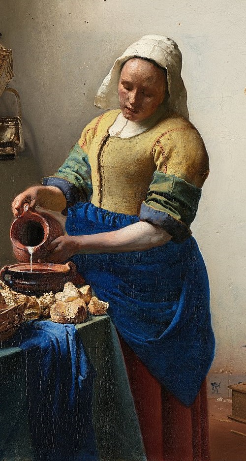
The light is one of the features which creates the attention-grabbing boldness of the central figure, and renders her monumental. Her right shoulder (on our left), the top of her right arm, and especially the back of her right hand – the one holding the handle of the jug – are brilliantly illuminated, making them stand out against the shadows on the wall. On our right, the shadow which forms the curve of her left shoulder, and the right side of her left arm, stand out against the brilliantly illuminated wall behind. Vermeer enhances this by painting the thinnest of white lines around the edge of the sleeve as it comes down from the shoulder. The reversed contrasts of light and shade push her towards us, making her more immediate, more entirely present. Not only that, but the perspective pulls our eyes towards her. The horizontals of the window frame and the leading which holds the glass in place form orthogonals receding towards a vanishing point, placed at the crook of the maid’s right arm. As the vanishing point is theoretically our point of view, this means that our attention is focussed on the action of holding the jug and pouring.
The colour is also subtly vital. Her bodice is yellow, and she wears a blue apron. For me this is still a surprising colour for an apron (even given that I know nothing of the history of aprons), especially as Vermeer has used that most prized of pigments, ultramarine. The bodice uses lead-tin yellow, another good, traditional pigment, but nowhere near as expensive. For the sleeves – which are rolled up – he mixes the two to create green. It is almost a lesson in basic colour skills: yellow mixed with blue makes green – and in this case, the specific yellow of her bodice mixed with the distinctive blue of her apron makes this particular green.
The attention that the maid gives to the act of pouring also demands our attention: if she takes it this seriously, then so should we. This is not a haphazard act, but a careful, determined action, the support given to the milk jug by her left hand helping to make sure the liquid flows at precisely the right speed.

The measured flow of the milk has made people think that she is doing something specific, and one suggestion is that she is preparing a bread pudding. There is plenty of bread on the table, after all, and some of the pieces next to her bowl appear to have been broken. You have to put in exactly the right amount of milk, apparently, or the pudding would either be too soggy, or the bread would dry out and become too hard and crunchy. This is simple fare, made from wholesome ingredients with good honest labour. Again the light plays a major part, showing us the deep, sculptural folds in the sleeves and apron, and the form and textures of the bread and basket – and yet it does not do so with the highly focussed detail of a fijnschilder – or ‘fine painter’ – the name for artists like Gerrit Dou whose every surface is an almost microscopic exploration of precise surface textures, and yet not a single brushstroke is visible. As if he were a precursor of Seurat and the divisionists, Vermeer builds these objects up through a myriad of dots and dabs of paint. You don’t believe me? Look at this.
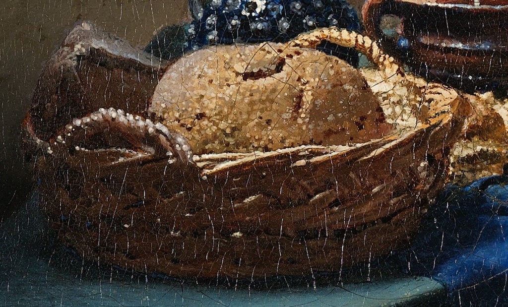
When talking about Vermeer it is hard to get away from the theories which try to explain his peculiarly focussed vision by suggesting that he used a camera obscura – basically a form of pinhole camera that projects an image onto a surface and allows you to trace the outlines. However, this would only provide the outlines, and not the colours or textures. Admittedly, the images a camera obscura produces can sometimes include some of the effects he uses – the bright, blurred highlights, for example. Although, if you think about it, you only get bright highlights on shiny objects, not on matt loaves of bread. This may well be the sort of effect you could see with a camera obscura, and that may be where he got the idea – but he would never have seen the particular highlights painted here. They are part of the magic of the image, and create the wonder – and some of the texture – of this fresh bread, the bounty of this work-a-day basket. As it happens, the construction of the perspective also suggests that he didn’t use a camera obscura: it isn’t traced, but drawn. Technical examination has revealed a pin hole in the canvas itself, at the crook of her right arm – the vanishing point. Vermeer would have inserted a pin, and tied a piece of thread to it. This could be covered in something like charcoal dust, pulled taut, and then snapped against the canvas to ‘draw’ lines onto it. It was a common way of working out perspective, as the lines drawn inevitably lead to the vanishing point.

When we get down to the bottom of the painting the lesson in colour continues. Under the apron the maid’s skirt is red – so she is wearing muted versions of the three primary colours, yellow, blue and red. This particular shade also harmonises well with the brick-red floor, and the ceramic pot, one of the truly revealing details in this painting. It is part of a footwarmer – a wooden box, with a perforated top – and the pot would have held hot coals. A practical object perhaps, given that we are presumably in a cold kitchen, ideal for keeping and using dairy products, although it is very small compared to the size of the room. In any case, footwarmers were used when seated. Behind it is the wainscoting, made of Delft tiles – local produce, of course, as it was in Delft that Vermeer lived and worked. Three tiles are visible, and the imagery of two of them can be read. On the left is cupid, wings to the left, firing his bow and arrow to the right, and to the right of the footwarmer, there is a man with a walking stick. Are these relevant? Probably. Have a look at this picture from the Sinnepoppen, an emblem book published by Roemer Visscher in 1614.
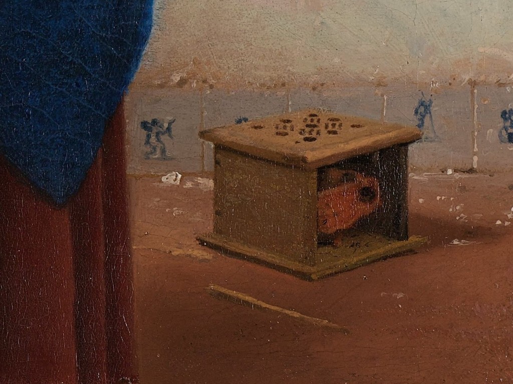

Any emblem has three elements, ‘pictura’, ‘inscriptio’ and ‘subscriptio’ – or picture, heading, and explanation. For the title of his book, Visscher invented a new word – where ‘sinne’ means the ‘sense’ of the emblem, and ‘poppe’ means the image. By creating a word that combines two elements from which we can determine the meaning, he is echoing the function of an emblem precisely. Neither the pictura nor the inscriptio gives the full sense on its own – they have to be considered together. The relationship between them – what, together, they mean – is explained in the subscriptio. In the example above, ‘Mignon des Dames’ means “the ladies’ favourite” – as in sweetheart, or lover. The subscriptio goes on to explain that modern ladies love nothing so much as a foot warmer, as it provides them with constant warmth. Any man who wanted to pay her court would find himself playing second fiddle to this household object. They can be seen often in Dutch 17th Century genre paintings, but even Visscher’s explanation doesn’t fully account for their presence. That is because Visscher wants you to be as clever and inventive as himself, and is always expecting you to make connections and take the meaning further. Think about it: when seated, the hot coals would fill the user’s skirts with warmth. Presumably, any potential lover would have prove as reliable if he wanted any degree of success. Combined with the image of cupid shooting an arrow towards the source of heat, the implications are that our maid could easily be the subject of inappropriate attentions, welcome or otherwise. It’s worthwhile bearing in mind that it was usually assumed that milkmaids were sexually forthcoming.

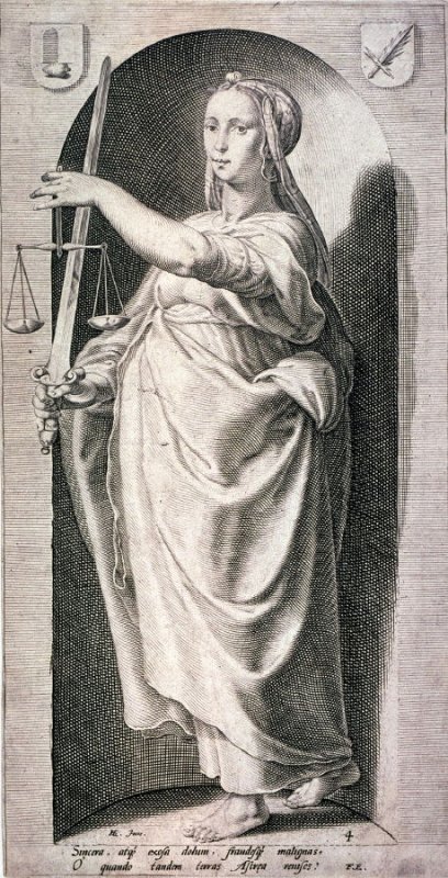
Having said all that, from this point on you can make up your own mind. And that’s not because I don’t want to tell you what is going on here, or because I don’t know what is going on here, but because Vermeer’s great genius includes the ability to leave things open. Is it coincidence, for example, that her skirt plays with the same tonalities as the earthy floor and the glowing coals, which we can imagine but not see? Does it imply a heat within? Or does the fact that she is standing, at work, rather than sitting down enjoying the welcome updraft, suggest that she is a figure of virtue, rather than potential quarry, worthy of pursuit? It’s possible that the very title of this painting is incorrect, as it happens. A milkmaid would work outside, with the cows, milking. The woman in the painting is really a kitchen maid (although in some households they did double up, apparently). But then, kitchen maids often had the same reputation. I cannot get away from the care with which she pours, and I suspect that Vermeer is questioning the assumptions we make about the people, and objects, depicted by his contemporaries. The first assumption is that milkmaids – or kitchen maids, for that matter – were bound to be ‘up for it’. After all, in this case, she seems entirely focussed on her work. The tile with cupid and the footwarmer might imply sexual impropriety – but do either have any effect here? In other hands the jug itself might seem suggestive. Artists like Jan Steen regularly show women holding vessels with open apertures towards men who reciprocate with any number of phallic equivalents, from bulging bagpipes to pistols cocked. And yet here the act of spilling – which could be a sign of incontinence – of sexual incontinence, that is – is entirely controlled, and measured. If our maid represents anything, then maybe, for Vermeer, she could be a modern-day Temperance. Compare her with this print by Jan Saenredam, made in Haarlem in 1593, based on a design by Hendrick Goltzius.

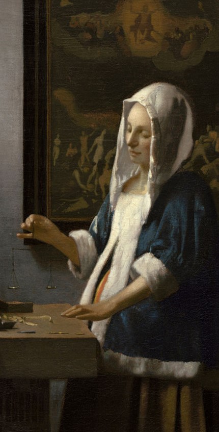
This is the most common representation of Temperance – although not that we saw painted by Giotto, who has her sheathing her sword (see Day 59 – Virtues vs Vices), or for that matter, the version painted by Ambrogio Lorenzetti in his Allegory of Good Government, in which she watches the first known image of an hour glass. In Saenredam’s personification she carefully pours liquid from one vessel to another – usually interpreted as watering down the wine, a true sign of Temperance, as opposed to complete abstinence. This careful, measured pouring is precisely what our maid is doing. And if she is Temperance, then maybe we could interpret another of Vermeer’s paintings, Woman Holding a Balance, as a personification of Justice. The comparison here is also from the series designed by Goltzius in 1593, but this time executed by different student, Jacob Matham. I don’t have time to say more about this painting now, unfortunately, but I will discuss it on Wednesday when I explore The Art with the Art.
Before then, though, what conclusions can I draw about The Milkmaid? Is she awaiting an assignation, or, conversely, distracting herself from temptation by concentrating on her work? Is she a figure of virtue, expounding the positive values of honest labour? Could she be a personification of Temperance? Vermeer’s focus, his attention to detail, the care with which he has structured the composition, combined colours, balanced tones, and modulated light, not to mention the dignity he gives to his subject, an apparently commonplace maid made monumental, suggests that there must be more than meets the eye. What is this painting about? What is going on? Well, there is a woman pouring milk. What more do you need?

Richard,
Wonderful. So much to think about. I want very much to book for your talk on Wednesday but regrettably it clashes with another commitment. Can I pay and then access it at a later date or is it ‘live’ only?
Kind regards,
Sandy
PS Loved your Story of Art module 3 through the National Gallery that’s just finished.
>
LikeLiked by 1 person
Thank you, Sandy, I’m so glad you enjoyed module 3! And you will be able to see Wednesday’s lecture after the event. Unlike me, AHA do record the talks: you should email charlie@arthistoryabroad.com who will tell you how to pay, and will send you a time-limited link to the recording.
LikeLike
p.s. the best thing to do would be to book online, so you have paid, and email Charlie to let her know you would like a link to the recording. You can book here:
https://www.arthistoryabroad.com/dates-fees/dilettante/london-lectures/live-and-online-lecture-vermeer-feb-2021/
LikeLike
Dear Richard,
I am booked on the AHA talk and looking forward to the lecture.
best wishes, Brenda Cameron
LikeLiked by 2 people
Excellent – thank you – I do hope you enjoy it!
LikeLike
Thank you for this commentary on one of my favourite paintings – wonderful! I understand it much better on the technical level now. For me the emotional impact of the painting is in the dignity accorded to a humble, plain sturdy woman engaged in giving a commonplace domestic task her full attention. And she is absolutely in the moment.
LikeLiked by 1 person
It’s so true – it is the dignity and simplicity which makes it ring true. There are times when I just want to say ‘Just look at that, it’s lovely’. But that doesn’t always make for a good read!
LikeLike
This is a marvelous work, and your analysis opens new horizons. Thank you.
I don’t want to get too bogged down in close reading, but while the crook of the right arm works well as a vanishing point for the the windowsill and glazing, it does not for the footwarmer, where the perspective lines seem to go, well, somewhere else. The table appears to be a peculiar shape too, with that right edge zooming away.
And I can’t help thinking Vermeer is making a deliberate link (or perhaps just as pointedly, not making a link) to the other woman who is usually painted in blue.
LikeLiked by 1 person
You’re right – the table is a very strange shape. However, the footwarmer would only match the perspective of the window if it were lined up in the right orientation i.e. square to both walls – and there’s nothing to say that it is – i.e. square to the walls. And yes, several scholars have linked the light coming in through these windows to an Annunciation – although more often in the paintings in which the woman is reading a letter.
LikeLiked by 1 person
Does Your observation about the pinhole mark of the vanishing point, totally rule out the use of a camera obscurer?
Are there similar holes on any other Vermeer paintings?
Thanks for your inspiring Module 3
LikeLiked by 1 person
You’re right – just because he used a pin and thread for the perspective, it doesn’t mean he didn’t use a camera obscura elsewhere. I think he did use it, and saw the effects it produced, and used those effects in his paintings. I don’t think there is anything specifically in ‘The Milk Maid’ that suggests that he did for this painting, though. To be honest, I haven’t read about there being evidence of pinholes in and of his other canvasses, but as I haven’t yet got round to reading the essay I have on his use of perspective – which was often very specific – there may well be others.
I’m so glad you enjoyed module 3!
LikeLiked by 1 person