
On December 15, 2002, nordbahn started operations as a new public transport company between Neumünster, Bad Segeberg and Bad Oldesloe. The aim was to become a natural part of Schleswig-Holstein. To this day, the Nordbahn is the railway company with the largest regional connection. A corporate design in the national colours, the regional communication and the importance in the region. Everything fits together.

1. brand design:
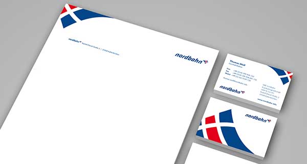
Logo development and positioning
The existing logo of nordbahn was very small, not striking and not contemporary at all. As part of the vehicle redesign, the logo was also to be revised. It should form a strong visual bracket over the overall appearance (vehicle, media), requirements were: 2-color, harmonious symbolism for a railway company, compact overall form and good legibility. Using a positioning chart, we developed a system that made our favourite the winner.
2. corporate design:
The nordbahn shows color
The new logo consists of a modern, sleek word mark with a modified “n” that is particularly dynamic. The logo leaves room for interpretation in the North German context (Assoziationen: Flag, dragon, coat of arms, pennant, sail, S-H, wide country, wind, movement etc.). Red, blue and white are the colours of Schleswig-Holstein. The logo is clearly structured, striking, offers a lot of belonging to the North, but also to locomotion and seems contemporary.

3. exterior design:
Dynamic through the flat plane
We transferred the dynamic elements of the corporate design to the vehicle design, determined the colour scheme and materiality in the interior and selected a suitable textile design.

4. communication design:
Fresh polished!
For the start of the north runway, we focused on the brand new trains. The trains are a regional enrichment and are presented as a natural part of the flora and fauna of Schleswig-Holstein. Not only the cows and sheep are amazed. In common parlance, the two routes are also called lamb and cow tracks. Since on the first timetables, the routes are also differentiated.

5. communication design:
Goodly managed, better informed
a new transport authority. We looked at a lot of communication patterns and developed a very simple but vivid design pattern for the nordbahn, which was well structured by appropriate icons, in order to guide the passenger to their information as quickly as possible.
6. communication design:
The wild, wild north
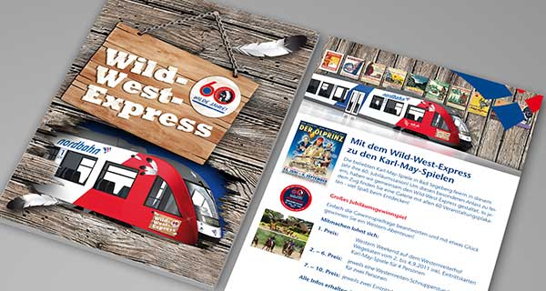
Cooperation with leisure partners along the route is an important part of transport company marketing. In the case of the nordbahn, there are numerous leisure destinations with which special conditions for passengers are negotiated. For example, the Karl May Games in Bad Segeberg, which get their own train, an exhibition of posters from the last 50 years on the train, and much more.

7. communication design:
A lot to do between the seas
Why wander into the distance when the good is right in front of the train door? There are so many beautiful destinations along the route that are worth seeing. To give passengers and tourists an impression of the many possibilities, there are seasonal brochures and mailings.

8. communication design:
How easy it is to start your trip to the North
Clearly arranged screens lead to the ticket of your choice. And all that in Nordbahn Look & Feel.
Translated with www.DeepL.com/Translator
