Display typeface

from Omnibus-Type
designed by Renata Polastri

32 Styles

2 Styles: Grenze, Grenze Gotisch
9 Weights: Thin to Black
with matching italics

Best for

  • Headings (display text)
  • Long reading text (body text)
  • User Interfaces (functional text)

License

Free and Open Source

Specialty

Grenze is a hybrid development between Roman and Blackletter styles. And this really works out, leaving your text readable while conveying a medieval vibe.

My thoughts on Grenze

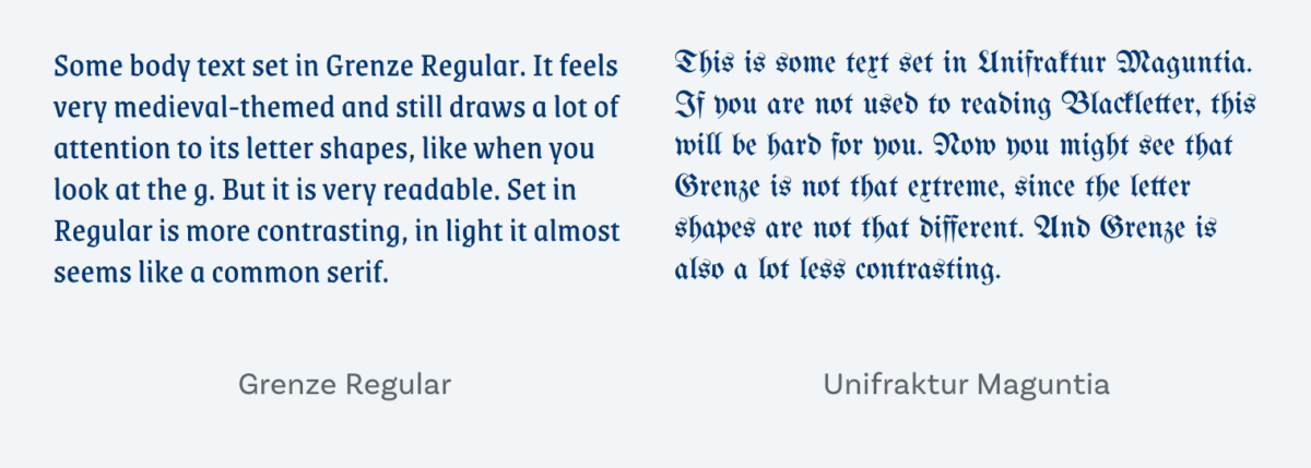
Grenze is a free font designed by Renata Polastri and the Omnibus-Type Team, and available on GoogleFonts. It is a hybrid development between Roman and Blackletter styles, in search of combining the impact and attraction of texture with the readability of classical forms. And this really works out. I applied it to the body text of my smartphone example above. You might say, well this is too striking for a body text. Yes, some letter shapes draw a lot of attention to themselves, especially the g, but see how readable it is! When you compare it to a real Blackletter typeface you see the difference.

On the left some body text set in Grenze Regular. It feels very medieval-themed and still draws a lot of attention to its letter shapes, like when you look at the g. But it is very readable. Set in Regular is more contrasting, in light it almost seems like a common serif. On the right This is some text set in Unifraktur Maguntia. If you are not used to reading Blackletter, this will be hard for you. Now you might see that Grenze is not that extreme, since the letter shapes are not that different. And Grenze is also a lot less contrasting.
In Blackletter the letter forms are different which makes it much harder to read if you are not used to it. Compared to a real Blackletter typeface like Unifraktur Maguntia you see how readable Grenze is.

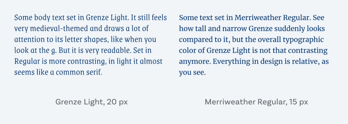
So for display text Grenze definitely works. But I’d challenge you if you have a website of an app – say about craft beer or a medieval festival Grenze might be a distinct, readable typeface you are looking for. Maybe even for some body text, if the sit is not too text heavy. For functional text it won’t work, it’s too delicate, narrow, and tall.

On the left Some body text set in Grenze Light. It still feels very medieval-themed and draws a lot of attention to its letter shapes, like when you look at the g. But it is very readable. Set in Regular is more contrasting, in light it almost seems like a common serif. On the right Some text set in Merriweather Regular. See how tall and narrow Grenze suddenly looks compared to it, but the overall typographic color of Grenze Light is not that contrasting anymore. Everything in design is relative, as you see.
For body text Grenze Light might be a good choice. It’s still very tall and distinct, compared to Merriweather for example. Everything in design is relative.

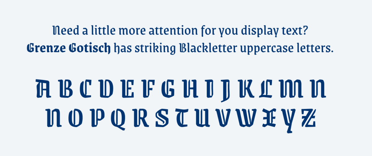
I’m closing with a particularly nice feature – Grenze has a companion called Grenze Gotisch. There the letter shapes are more medieval looking, especially the uppercase letters. And isn’t it nice to have options? Fun fact, I accidentally picked Grenze Gotisch at the very beginning of this video.

Need a little more attention for you display text??Grenze Gotisch has striking Blackletter uppercase letters.
Grenze Gotisch is the companion of Grenze.

Recommended Font Pairing

You are looking for a good typeface for long reading text or functional text in combination with Grenze? Choose Ruda!

Grenze (free)
Grenze (free)
  • Headings
  • Copy
Ruda (free)
Ruda (free)
  • Headings
  • Copy
  • UI Text

Learn more about pairing typefaces using the Font Matrix.

So what do you think? Is it too much for body text? Perfect for your next hipster craft beer label? Tell me in the comments below!

Typographic power to your inbox

  • Font Friday: I recommend one typeface per week, free fonts included.
  • Type Tuesdays: articles & videos that up your design game.
  • Join 2500+ typography enthusiasts, unsubscribe anytime.
Edition #17, published

Leave a Reply

Your email address will not be published. Required fields are marked *