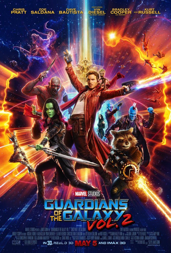
In Guardians of the Galaxy, 2 use of colors is very important and also surprising. In a movie that takes place in the majority of the time one would not think to see such a high amount of vibrant colors. When most people think of space it is associated with darkness and cold. In Guardians, just from the cover, the eye is drawn to the use of high amounts of vibrant colors, it looks that all major colors are being used just in poster alone. The vibrancy of the colors also sets the mood for the entire film. Even from the first Guardians, the use of color was also present but the tone of the movie is light and there is even comedy in there as well. This method is also seen in the sequel but to a larger extent. The bright colors on the poster set the tone that there is to be more comedy and lighter message in this film than the previous one. Also, the yellow ring of light around the characters let the viewers know who is the main focus of the movie. I am a fan of the Guardians franchise and the use of colors within the film directly relates to the poster itself. The time period the movie is set in is the early 1970’s-80’s, and that time period alone is associated with the use of colors in outfits, such as hippies and also a time of relaxation. The category that this movie fits under is obviously superhero movie, but also Sci-Fi. Almost all sci-fi movies are known for their use of color. Space, a “location” known for being dark and desolate, it sets the tone for the film as being scary and slightly boring. Guardians, on the other hand, take that ideology and flip it; making space a color-filled escape. Compared to my previous post of the movie “Jaws” the Guardians poster is absolutely more in your face. We can see this trend change overtime as CGI and computers came onto the scene. The Jaws poster was more dreary and did not draw the viewer in. Also, the poster for Jaws was straightforward and the viewer knew what the main idea of the movie was the shark. With Guardians, the viewer just sees the characters that he/she knows are in the movie, but we do not know the impact or the outcome each of those characters has. Overall, the Guardians movie poster is one of the more “out there” kinds of movie posters that I have seen. I am a fan of this style and use of colors because it keeps the film lively and also is aesthetically pleasing to watch.

I never really thought about the ring bringing attention to the main characters, but you are right. The light that emits from the ring, brings emphasis on the characters and it makes them stand out more than the several tiny ships in the background. I do think the color reflects the time period, however, the movie takes place in modern days, not the 80s. There was a flashback in the movie that was from the 80s however. I think nowadays, to really grab people’s attention, bright colors are needed. I think most people will agree though, that bright colors are seen as attractive. When most people see black and white, they think of antiquity. For instance, when television first came out, it was seen in black and white, but now, it’s in color, and as television went on, brighter colors were used. So in a way, bright colors can be associated with the future, which fits with the vibrant colors used in the movie poster, because even though it takes place in modern era, Guardians of the Galaxy does show what most people think of when they hear future, like meeting aliens, going on multiple planets, and having spaceships that allowed us to do so.
LikeLike