The German word ‘Gestalt’ means an organized whole that is perceived as greater than the sum of its parts. The principles arose at the start of the twentieth century when research revealed that people are able to perceive images created from many different elements as a ‘whole’ because their minds subconsciously arrange different parts within an organized system.
Gestalt principles are being used today to influence the creation of intuitive, user friendly user interfaces (UI). But what are the Gestalt principles and why are they relevant to UX and UI design? In this article, Katarzyna Suwała, UX and UI Designer at ITMAGINATION, explains the 6 most important Gestalt principles and their relevance to UX and UI Design.
Elements that are positioned close to each other are typically perceived as being part of one group. In the image below, the blue dots are commonly understood to be arranged in three columns. However, with just a small adjustment to the distance between the dots, it’s possible to change the arrangement so that people perceive the arrangement not as three columns, but as three rows. How we perceive this arrangement is all down to how the principle of proximity is applied.

In considering how the rule of proximity applies to user interfaces, we can observe that when an interface (let’s say a website) provides significant light between elements (i.e. space), users more easily perceive the separation of different information blocks. Put differently, if elements are arranged closely to each other, it’s more likely that a user will see them as all belonging to the same cluster of objects. UX and UI designers use this approach when they design interfaces. For example, options on website navigation menus are typically grouped together, giving the user the feeling that everything they need when it comes to navigating a site can be found in one place.
In the example below, we can see that the principle of proximity is used to indicate that the text and the empty field beneath it are related. The application of this principle makes it clear to the user that the First Name data should be entered in the first empty field and the Last Name data should be entered in the second.

The relationship and indication of which field belongs to which text label (and thus the expectation of the user) is less clear when the principle of proximity is not applied. In the example below, the Last Name text could be perceived as being associated with the text field above or below the text – it’s not as intuitive as it could be.

We – as human beings and users of digital products – naturally group together items that are the same shape, color and texture. For example, in the physical world, we associate sharp, pointy red shapes as a warning and round green shapes as an indication that we’re on the right path or that it’s safe or acceptable to proceed.
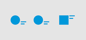
These are commonly and societally accepted associations that have been transferred from the physical world to the digital world. Within the digital world, a number of similar conventions have been adopted.
For example:
In the example below, we can see how the application of the principle of similarity (same image size, similar text lengths, layouts, etc.) enables the user to understand that these are three entries of the same type (i.e. news). Furthermore, the use of the same color at the top of the section as part of the tag shape (vertical line) at the bottom of each entry reenforces the notion that each entry belongs to the same content type as the category section above.

It’s human nature to look at an arrangement of elements and try to simplify it so that we can understand it more easily and better. For example, if we see two elements that are arranged symmetrically but are not joined, it’s natural for our minds to join them and thus reduce the number of elements that need to be considered. In this way, it can be argued that symmetry provides a degree of simplicity and predictability that enables an arrangement (or a design layout) to be understood more easily.
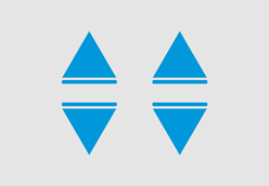
Within the context of UX and UI design, the rule of symmetry can be applied to laying out text, aligning text width with image width and other visual elements. The easier our eyes understand what they’re seeing, the more cognitive capacity is available to absorb the messages being communicated or to complete the tasks at hand.
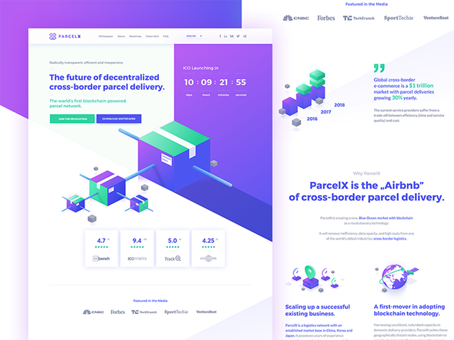
In the example below, the principle of symmetry is used to provide structure and order for the content and to the page in general.
Most of us are familiar with the image below and have been asked what we see – two heads facing each other or a vase.

As humans, we naturally seek to distinguish between a what’s happening in the foreground and the background. The image above is useful because it demonstrates that it is possible to become confused or interpret layout differently when there is no clear distinction between the foreground and background. Contrasts between foregrounds and backgrounds enable users to quickly see and understand what a page or interface is about.
Designers can use the principle of Figure/Ground to focus user attention on what is most important within a given interface. This is why, for example, when we visit a product page or a landing page, the first thing you are likely to see is an image of the product and perhaps a key slogan at the very center of the page and the options to ‘buy now’ or ‘contact us’ will be colored differently to other options on the page.
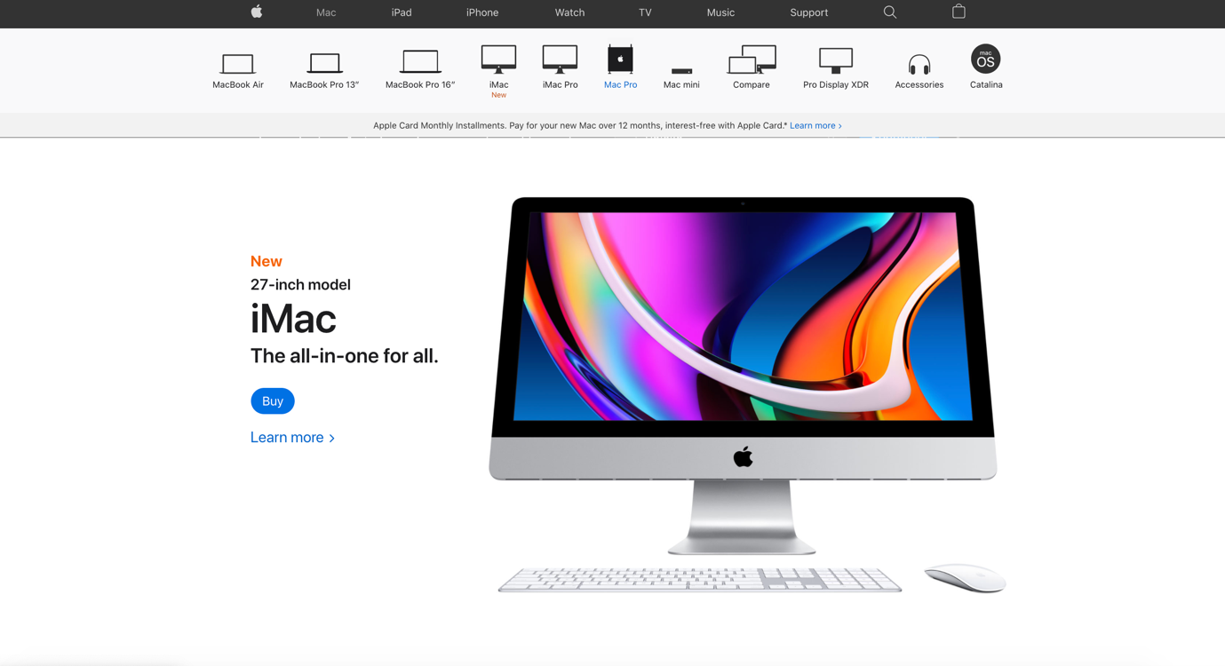
This is because the primary aim of the page is to showcase the product and encourage visitors to place an order or find out more.
Designers can also use the idea of negative space to increase impact or highlight key messages or brand assets (check out the NBC logo and the use of negative space to form a peacock shape).
In the example below, we can see how the principle of Figure/Ground has been applied to help bring the two credentials to the fore and thus make them stand out more strongly to the user. Interestingly, the same effect is not used higher up the screen but is introduced further down, perhaps to provide visual variety and to ensure key information (in this case, credentials) ‘pop’ out and attract the user’s attention.
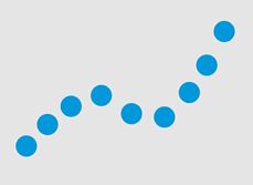
The human eye naturally detects trails that have been created from objects (different, the same or similar). When objects are arranged in a way that form a shape or line, our mind treats them as part of a bigger shape or as a whole. The elements that make up the shape can be different (e.g. color, size and shape) but their arrangement is what matters in our minds and allows us to form a whole.
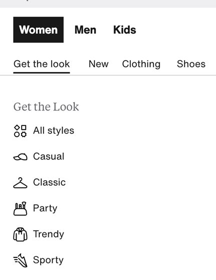
Designers can make use of the continuity principle to guide users to the completion of specific tasks (e.g. filling out a form or finalizing an order). By guiding users naturally vertically or horizontally with steps that are positioned close to each other, user eyes will naturally follow the line and move from one step to the next.
Similarly, continuity should be applied to primary and secondary navigation menus. Using navigations that use horizontal and/or vertical lines enables users to – with just a couple of clicks or hovers – understand the options available to them and navigate directly to the location within the interface (e.g. website). This works especially well for content- and option-rich interfaces.

This principle can be augmented by providing small visual clues (e.g. underlines) to indicate that the path of navigation path continues to a next level.
When a user looks at figures, symbols, signs and icons that are arranged in a way that leaves large open spaces, the mind naturally feels a sense of incompleteness and looks for ways for openings to be filled.
When we look at the image below, we perceive this as being a closed arrangement – a triangle with round shapes at each corner.

In reality, it is little more than three non-standard, pacman-style shapes arranged at equal distance from each other. The fact that the ‘openings’ of the shape face inwards (not outwards) gives us the perception of an arrangement that has closure and thus provides a notion of organization that our minds can deal with easily.
The principle of closure is particularly important to designers of logos, icons and symbols. It enables ideas or options to be communicated with the smallest amount of information possible. This affords designers the opportunity to keep interfaces simple and consistent, which improves flow for users.
In the example below, social media icons are adjusted and simplified. However, their consistent style and the use of the key components of each platform’s original icon enables users to easily understand their meaning and purpose within the interface.

The Gestalt principles are much more than what we’ve outlined above but these six fundamental principles can help support the development of junior UX and UI designers and should be considered by experienced professionals when designing any interface.
Sometimes we’re using these principles without even knowing it – and that’s because we’re following what our minds tell us is logical. Nonetheless, having Gestalt principles in mind enable us to craft user experiences that engage and satisfy users and enable them to complete tasks successfully.
Want your digital products to have interfaces that engage, satisfy and enable your users? Talk to ITMAGINATION about UX and UI Services.
Learn it. Know it. Done.
